While we all love to see those TV and social media home makeovers and house flips that turn a shack into a castle, that is not the way it usually happens. For most homeowners, time and money is very limited and while making the recommended changes will get a higher price for their home, they simply do not have the resources.
Under the guidance of a professional home stager, there is so much that homeowners can do to present their home in a more favorable light. After making sure that the home is in good repair and spotlessly clean, editing and rearranging furniture will go a very long way. Removing the distractions, putting the focal points in clear view, improving traffic flow and showing the intended use of rooms will have a significant impact on both the length of time a home is on the market and on the selling price.
It is hard for some homeowners to believe that the way they live in their home is different from the way it can be shown to its maximum use. The attachment to their belongings and décor often hold them back from doing what is necessary to sell. For these reasons, savvy real estate agents will suggest or provide a staging consultation even to homeowners who have not asked for it or think they can’t afford to stage their home.
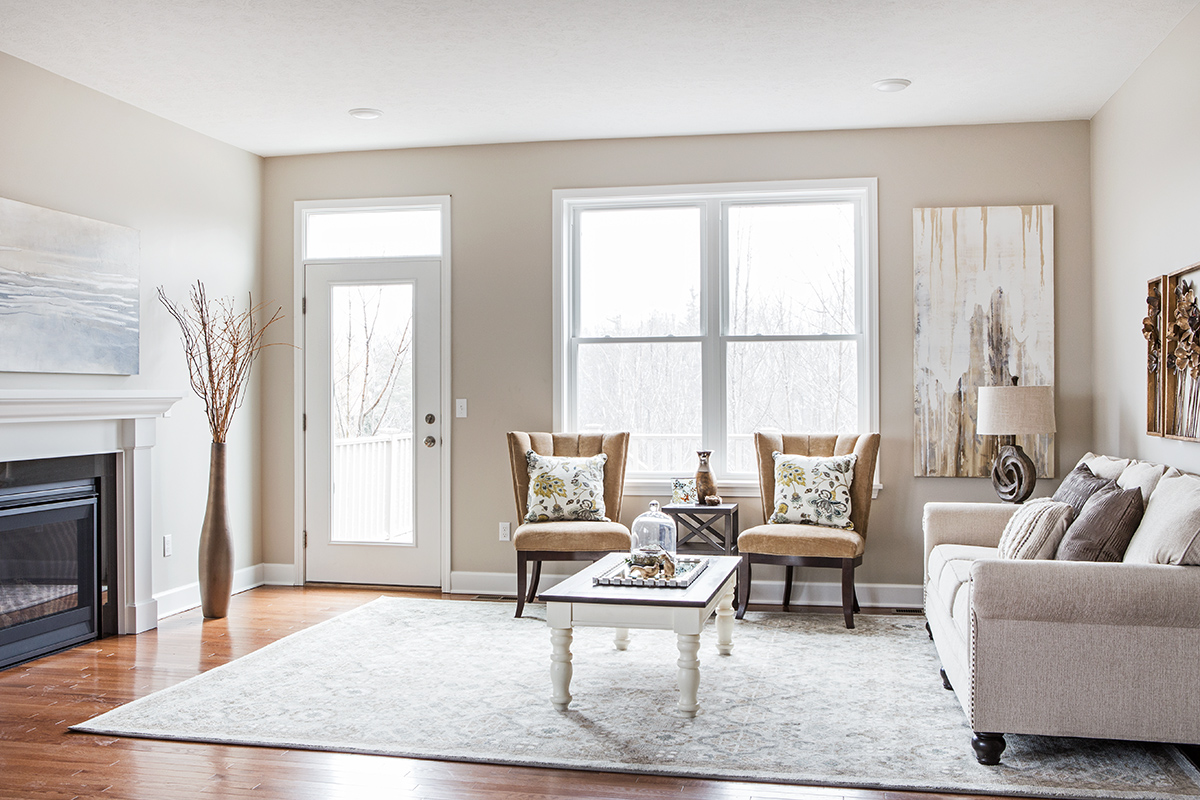
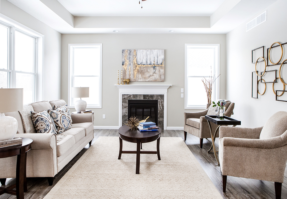
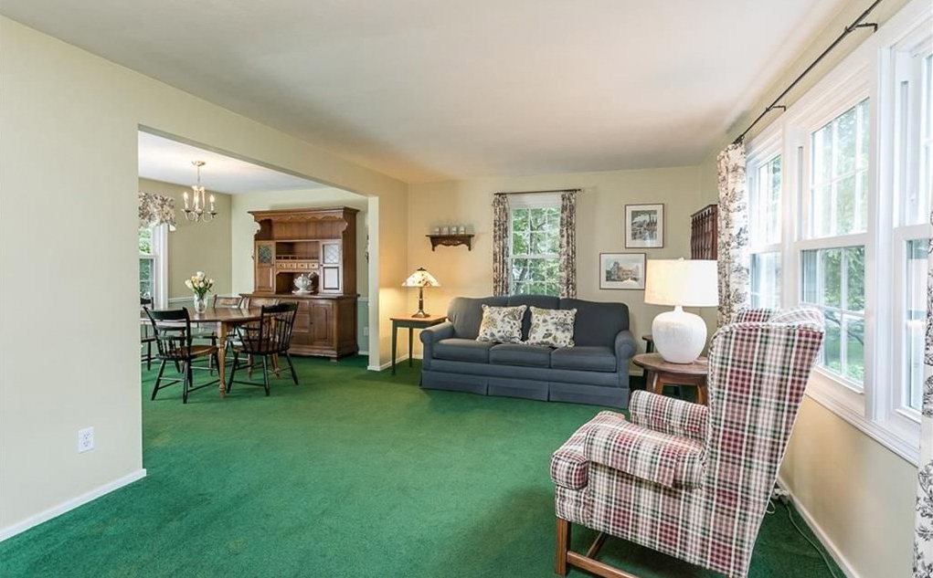
Here’s a peek into a home showing the before and after results of staging. The real estate agent included a staging consultation from Act Two Home Staging as part of her listing agreement. Following the instructions I gave them at the consultation, this is what the homeowners accomplished.
(Photos above) Removing the layers of window treatments on the sliding glass doors opened up the space, let in more natural light, and gave a clear view of the enclosed porch. Eliminating all the little distractions like the dark wood shelf hanging from the cabinet, the small piece of artwork breaking up the wall space between the door and cabinets, the full countertops and the clutter on the refrigerator had a big impact. The one update was changing the dated polished brass chandelier to brushed nickel.
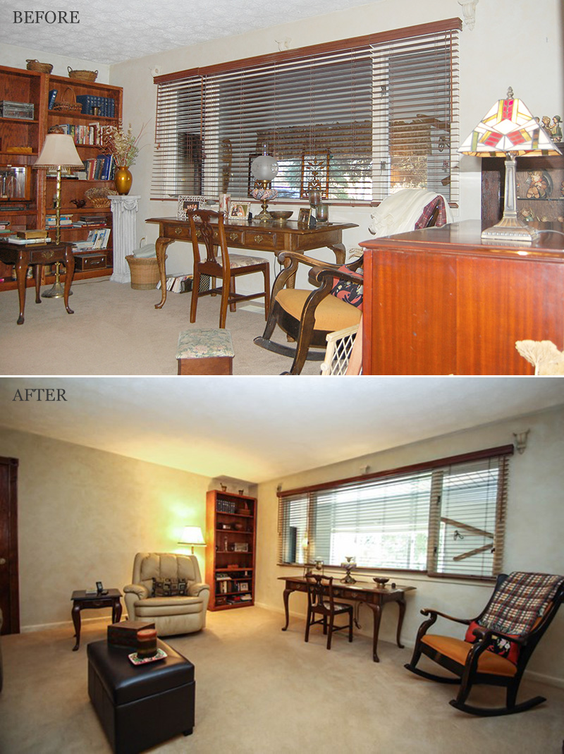
(Photos above) This room had way too much furniture, making it appear much smaller than it actually is. One wall was lined with three bookshelves (only two are visible in the before photo), two of which were removed. The bookshelves not only took up floor space but because of the height, they took up visual space also. Both the dark color of the wood in the shelves along with the valance in the window seen beyond the space made the room feel gloomy.
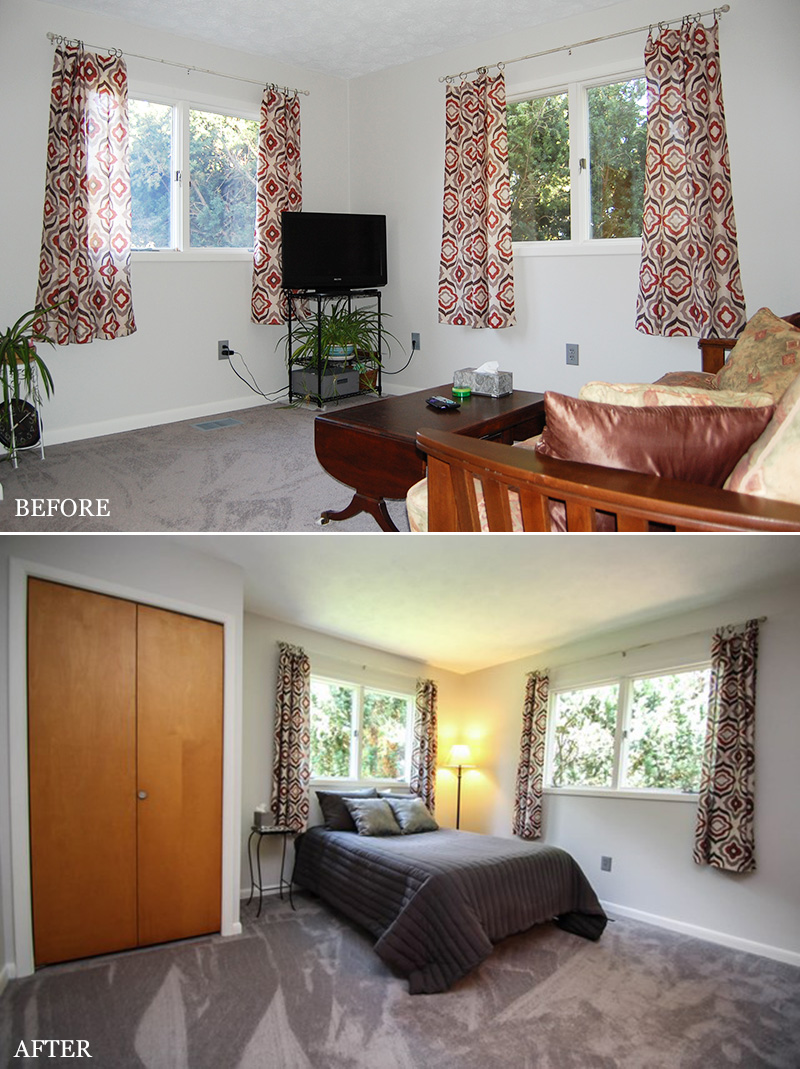
(Photos above) One of the bedrooms in this home was being used as a second TV/living room. This practice sometimes confuses buyers, especially when they are looking at listing photos and wondering why they aren’t seeing that third bedroom. If the room was designed to be a bedroom, it is best to demonstrate how to use it as such. Now it looks like a spacious bedroom rather than a small living room.
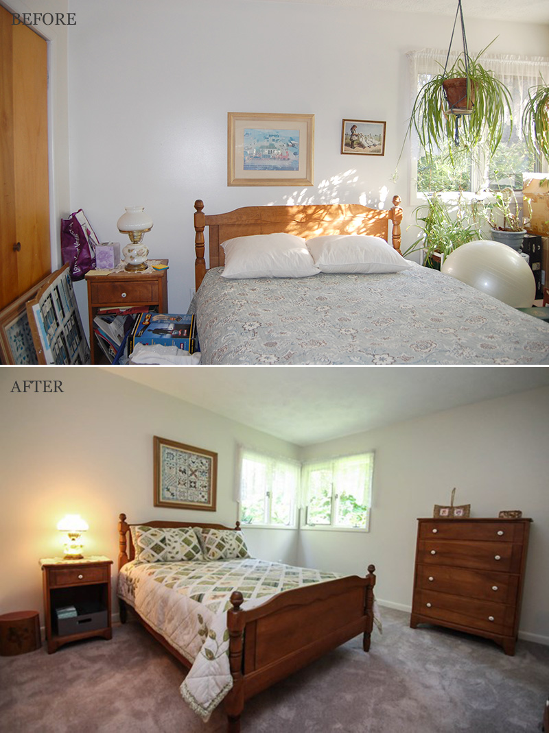
(Photos above) The best feature about this bedroom is the nice corner window but with all the plants, it was hard to appreciate it. Little things like changing the artwork to a more appropriate size and giving more attention to making the bed added to the balance and overall feel of the room. Removing all of the stored items in this catch all room was crucial.
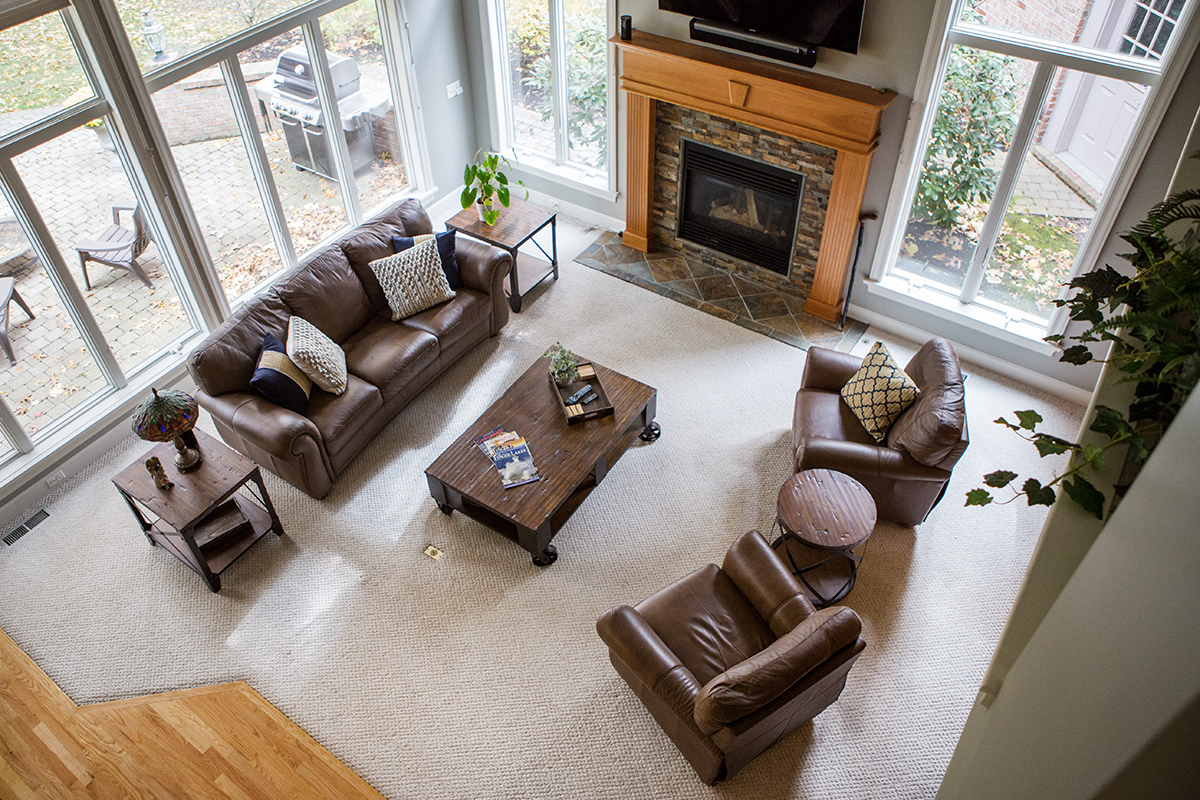
(Photos above) This huge room looked anything but big. The amount of furniture and volume of décor made it appear cramped. While still showing that the space is large enough to be a multifunctional room, the living room area was expanded by repositioning the sofa a little further back in the room. Having a more open floor plan as you enter the room adds to a feeling of spaciousness. Removing the sailboat from the windowsill and removing the hanging plant let in more natural light as well.
—-
After photos courtesy of Irene Bennett, Nothnagle Realtors


