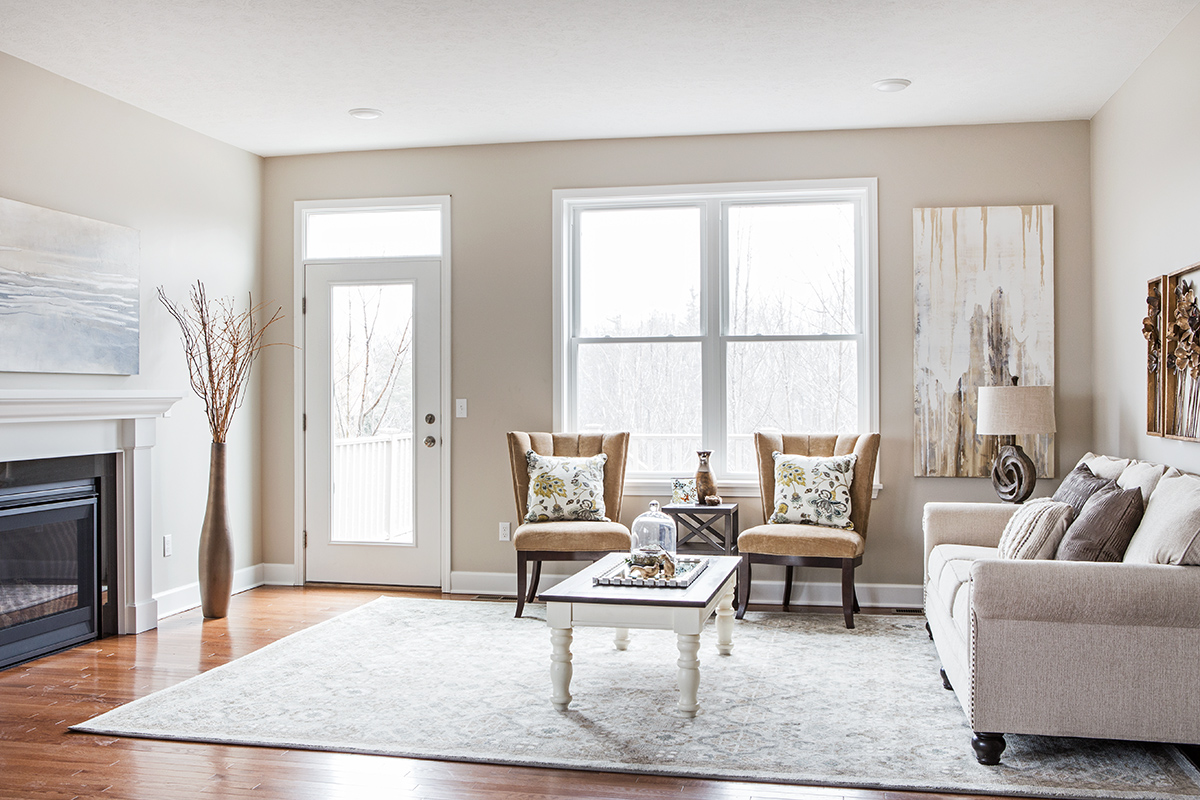
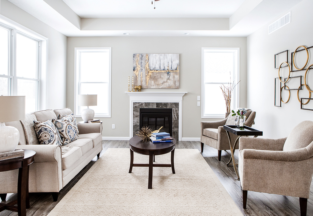
1. Accentuate the focal points through furniture placement.
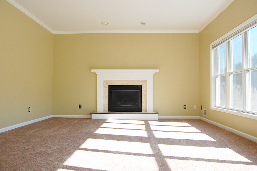
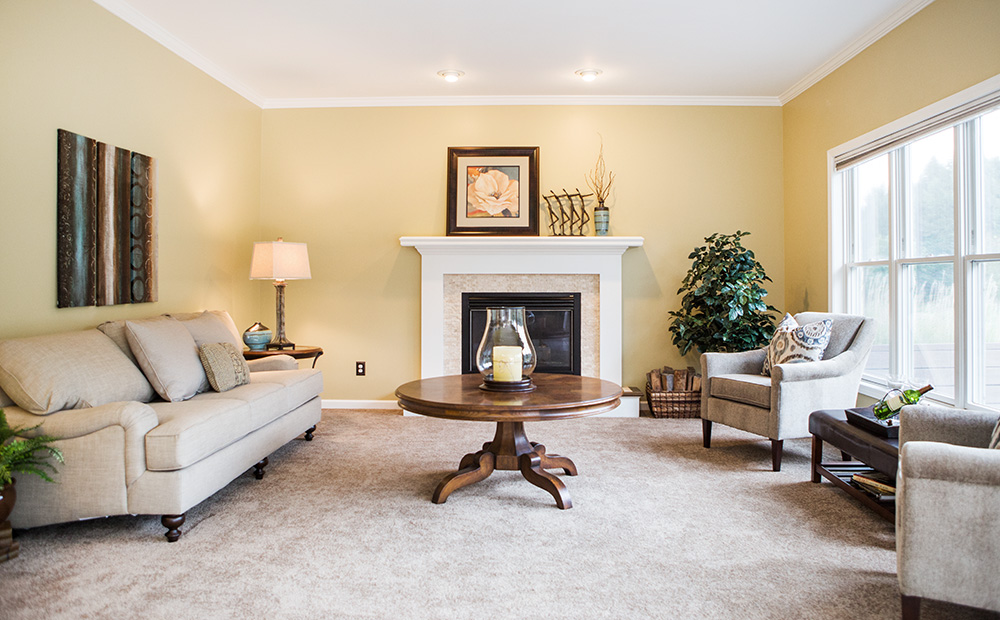
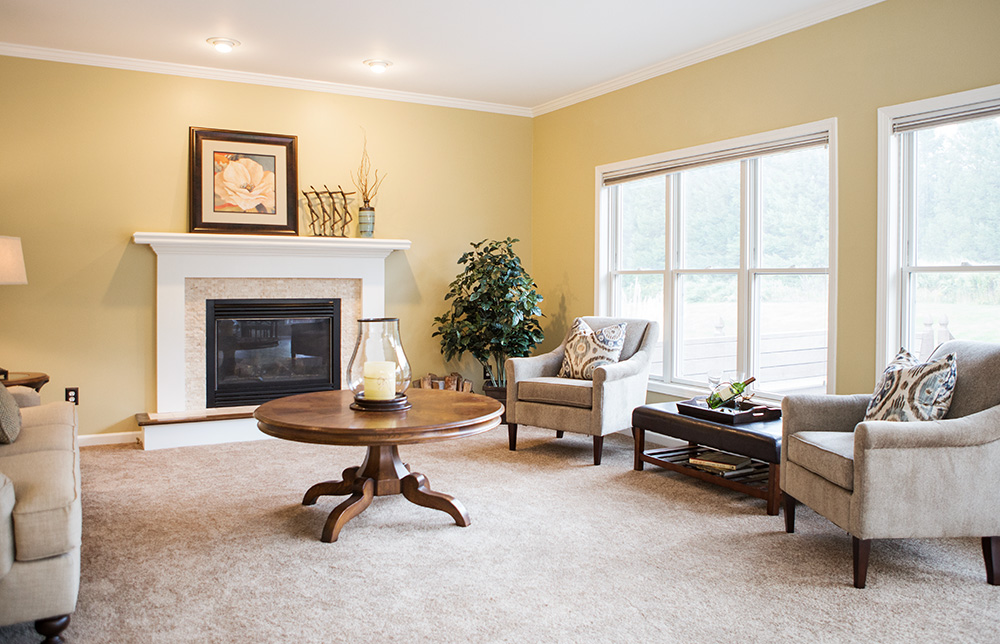
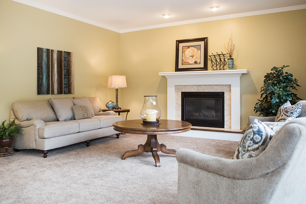
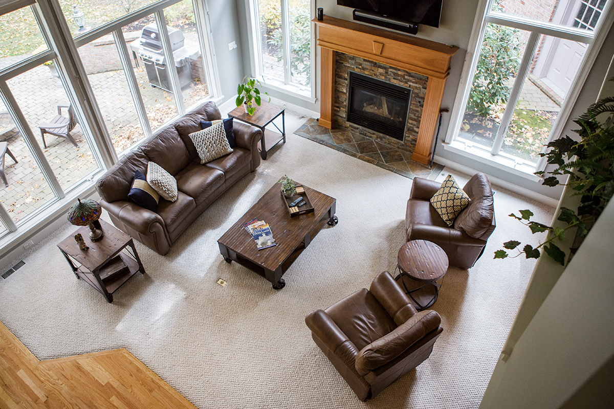
This living room has two focal points: the fireplace and the set of large windows. Centering furniture pieces on architectural features calls attention to those features. Note that the coffee table is centered on the fireplace and the chair arrangement is centered on the windows. From a practical standpoint, the coffee table is a bit too far from both the chairs and the sofa to be fully functional. Yet, for staging, it looks appealing and draws the eye to the selling point in the room. This is one simple way in which home staging to sell is different from decorating to live.
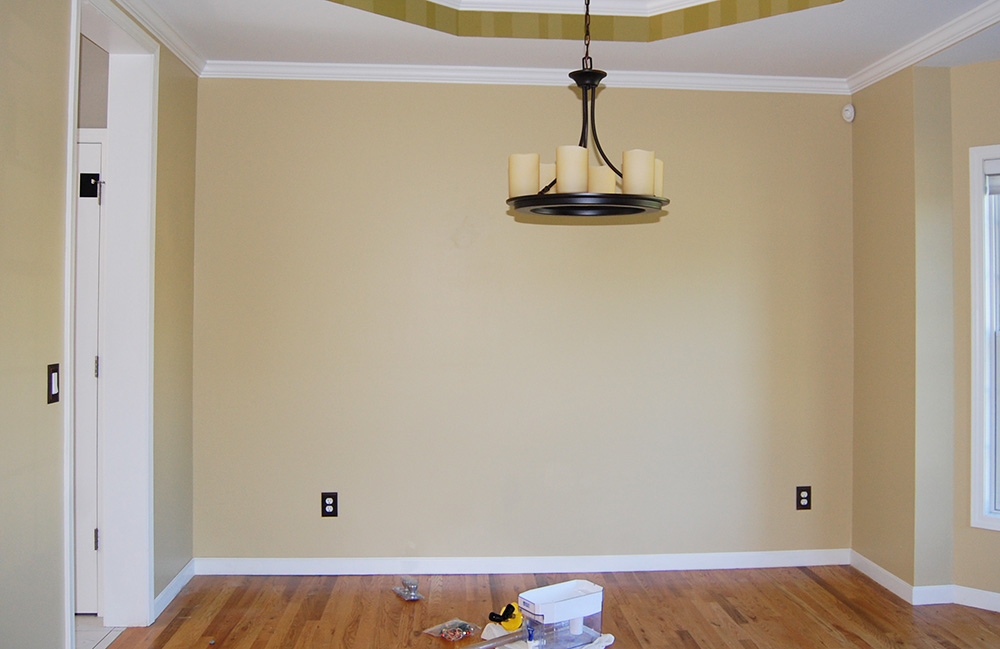
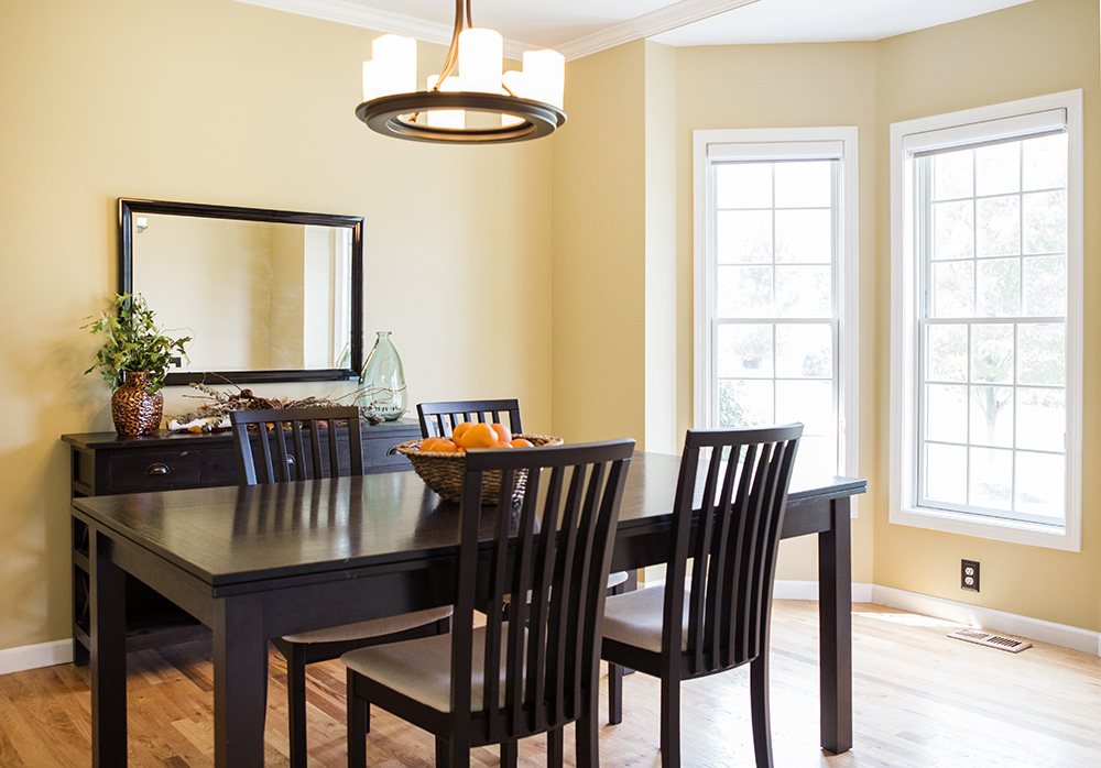
2. Furnish a vacant room to demonstrate size.
Without furniture as a point of reference, this dining room appears tiny. As you can see, with an average size dining table and a buffet there is still a lot of room to spare. While a china cabinet with a hutch would not have taken up any additional floor space, it would have eaten up visual space and made the room appear smaller and sometimes darker.
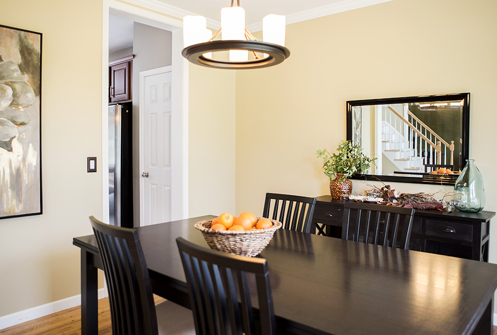
3. Use mirrors to make rooms appear larger.
The use of a mirror expands the space visually and reflects light. The reflection of the staircase in the photo also gives a buyer a glimpse at the home’s floor plan.
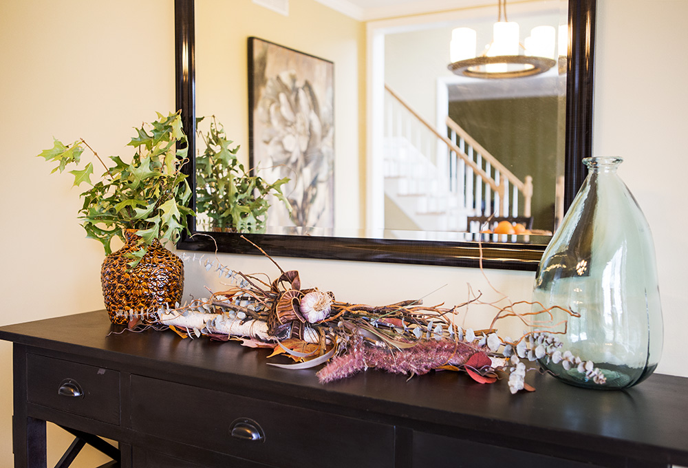
4. Use seasonal décor so that the listing always appears fresh and new.
Décor adds to the emotional appeal of a home. Make sure that it is appropriate for the time of year and not specifically to a holiday because it could quickly become dated.
5. Define a room’s purpose.
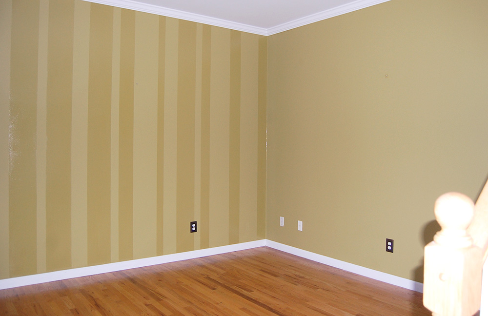
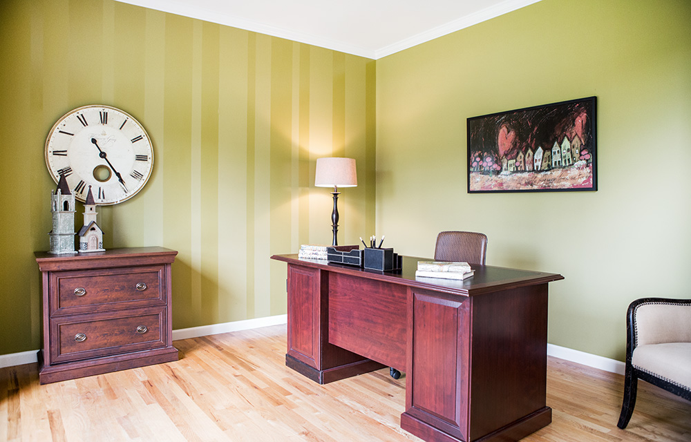
While the rule of thumb in staging is to furnish a room for its intended purpose, there are some exceptions. Formal living rooms that are very common in older homes are becoming obsolete. On the other hand, few older homes were built with offices. You can create larger appeal with today’s buyers by staging rooms according to changing home trends.
6. Tone down color schemes.
It is always best to have neutral wall colors but the reality is that some budgets just don’t allow for it. If you have a bright or taste specific color, it is best to use neutral furnishings to tone down the room. Adding a small accent piece that brings in the wall color, like the artwork shown, is all you need to tie the room together.
7. Create good traffic patterns.
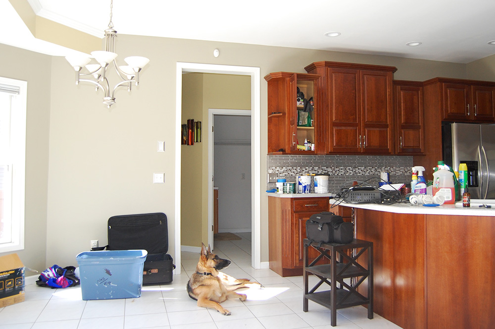
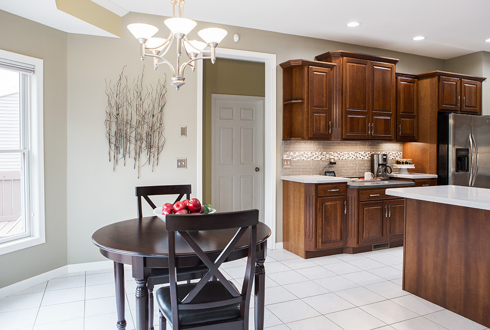
The size, placement and shape of furniture all affect the traffic pattern. Although not seen in the photo, this kitchen has a door that opens to a deck. The round table worked so much better than a rectangular would have because it leaves more room for the door to open and more walking space between the island and the table.
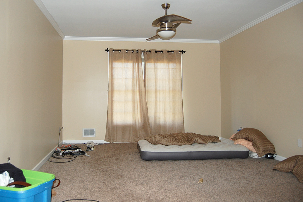
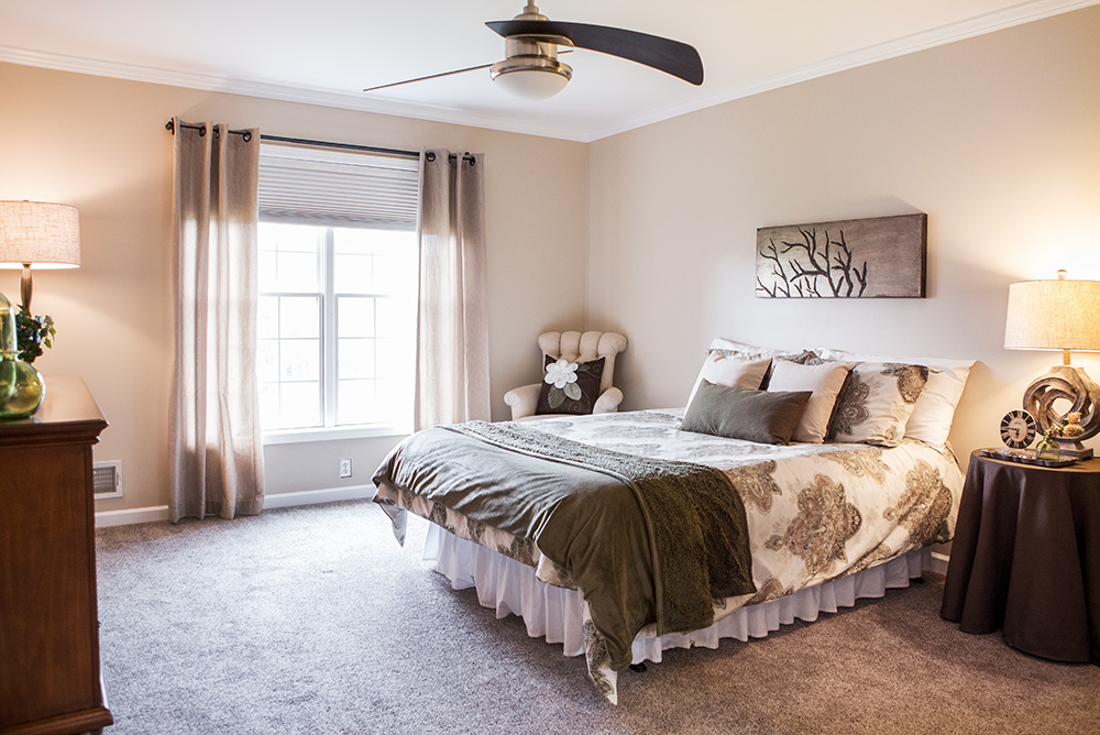
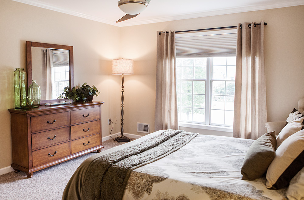
8. Give master bedrooms a relaxing and luxurious feel.
A well-made bed, soft textures, pillows and throws all help to give an upscale feeling to the room. Creating a corner where you can sit back and relax in a comfortable chair helps create the feeling of a master suite. Use tabletop and floor lamps to add mood lighting.
9. Add a whimsical element or two to make a home memorable.
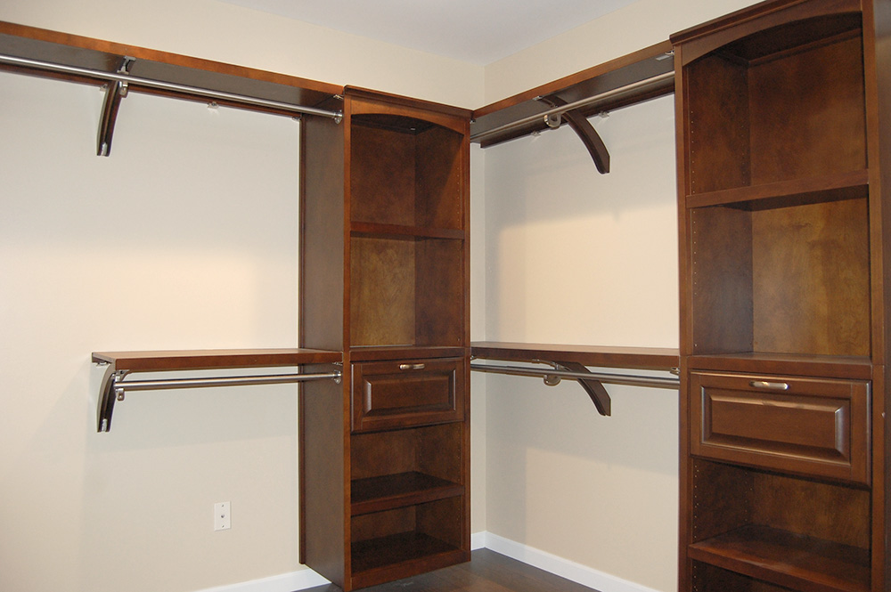
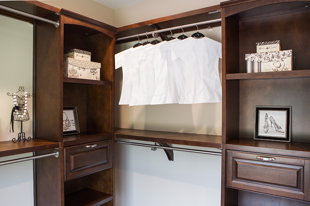
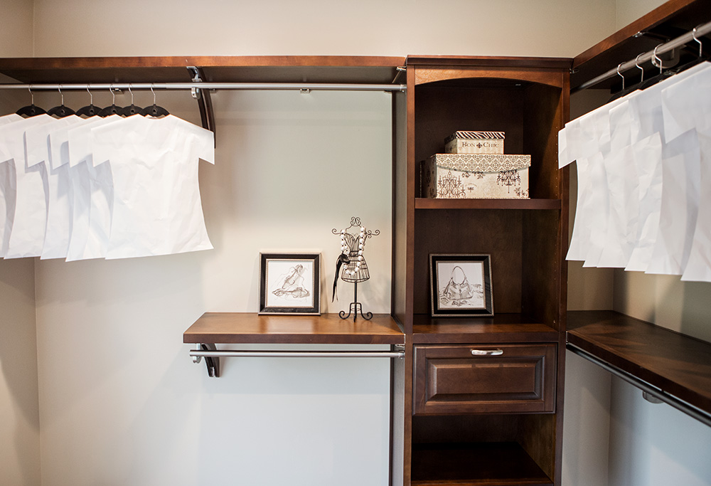
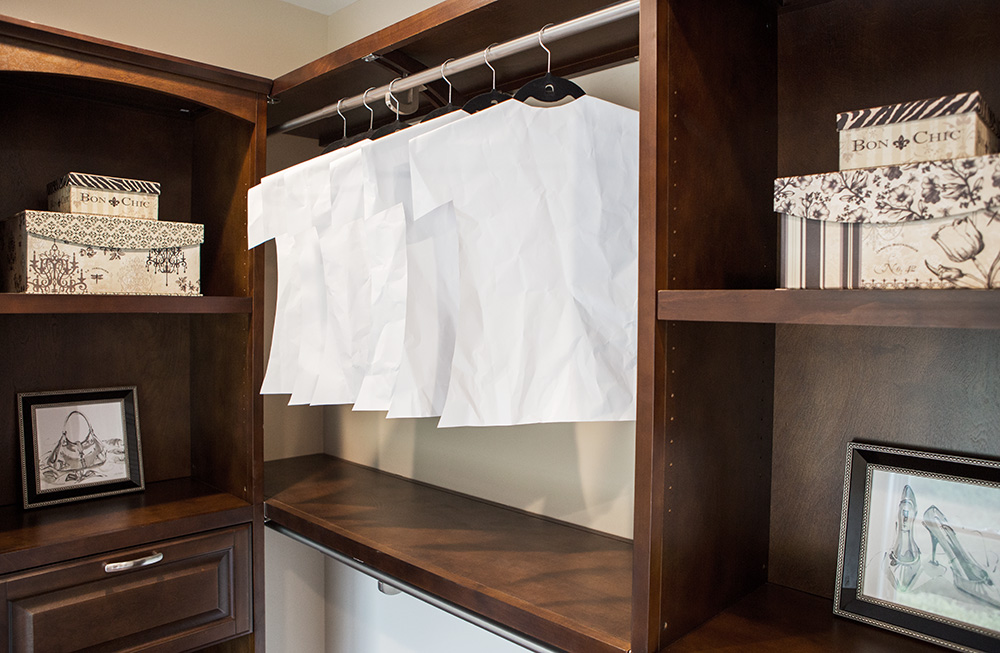
Since a big part of buying a home is based on emotional appeal, give buyers something to smile about. In this vacant home, we choose to use crinkled white paper shirts as props for a master bedroom closet that buyers won’t forget. (It worked on me because I could not forget The Aristo Company home at the 2016 Rochester Homearama where I first saw this).
10. Target your market.
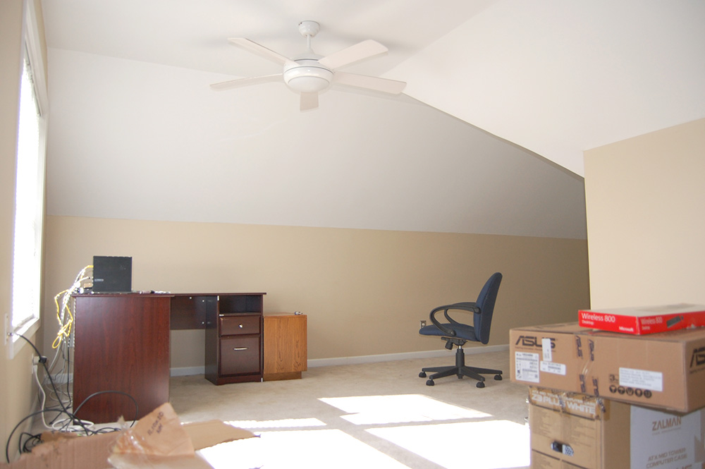
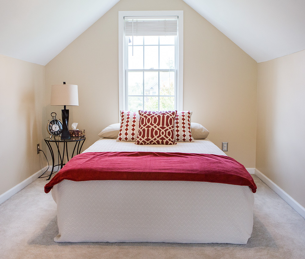
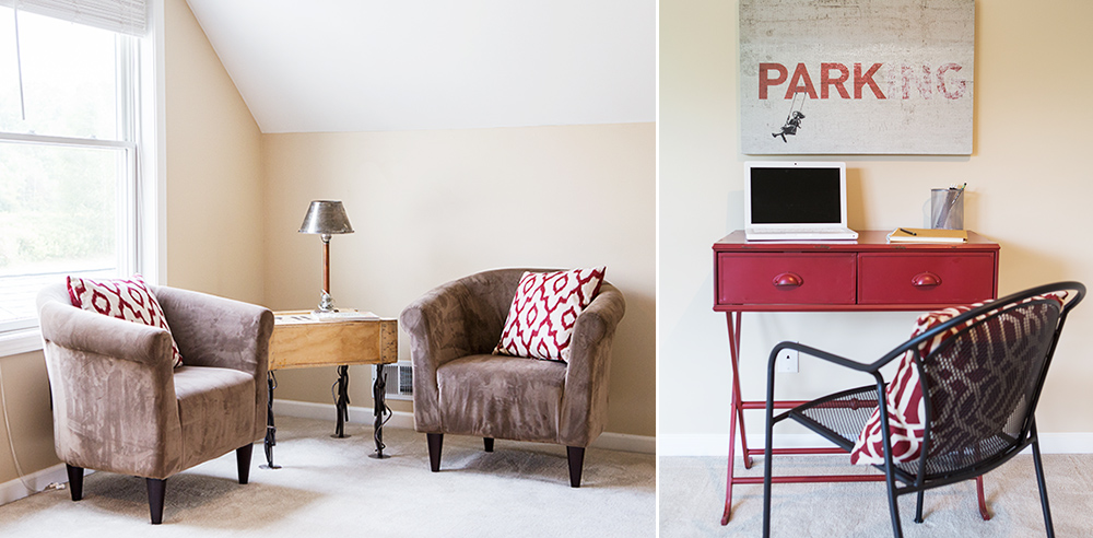
Knowing the demographics of your area is important when preparing your home for sale. If you do not consider the probability of interest from a particular group of buyers, you will miss the opportunity to connect through staging. In a neighborhood of growing families, this bonus room made a perfect teen suite. There is a sleeping area, a desk area for homework and a sitting area to hang out with a friend or two.

