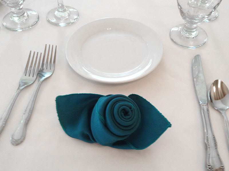
While we anxiously await the photos of my daughter Stephanie’s wedding, I would like to share a glimpse of the decor. As you might expect, I played a big part in the design. As with most large decorating projects, the fun is often in the details. I designed the wedding favors to coordinate with the larger theme by using the same color, shape and the blend of cultures. The bridal party color was “Oasis ” which is repeated in the ribbon on the favors and also in the cloth napkins that were shaped into roses.
The miniature wine glasses were filled with confetti which are candy-coated almonds. For centuries, Italian brides have been giving away confetti. The candy represents the bittersweet life of a married couple. The sugar coating is added to the bitter almonds in the hope that the newlyweds will have more sweet times than bitter during their lifetime together. I personalized the tag which Stephanie found on Pinterest. Since the groom’s native language is Spanish, the message to guests was written partly in English and partly in Spanish. In the coming weeks, check back in with us on both Facebook and our blog for more wedding decorating ideas.




Just curious, where did you find the oasis color ribbon?
Michaels on Monroe Avenue in Pittsford, NY.