Since the bulk of projects for most home staging companies is to work with what homeowners already have in place when their home is about to go on the market, it is always a thrill to stage a vacant home and be able to start with a blank slate. And that was the case with this builder’s model home.
It is wonderful to create a perfectly organized room where there are no constraints of actual daily life. There are no piles of paperwork, no toys or baby paraphernalia and no dirty clothes to hide. The key to staging a model home is to make it look lived in but in a perfect way. There is always a risk of making it look too “staged”. The idea is to find that happy medium between a totally unrealistic model home and a well lived in residence.
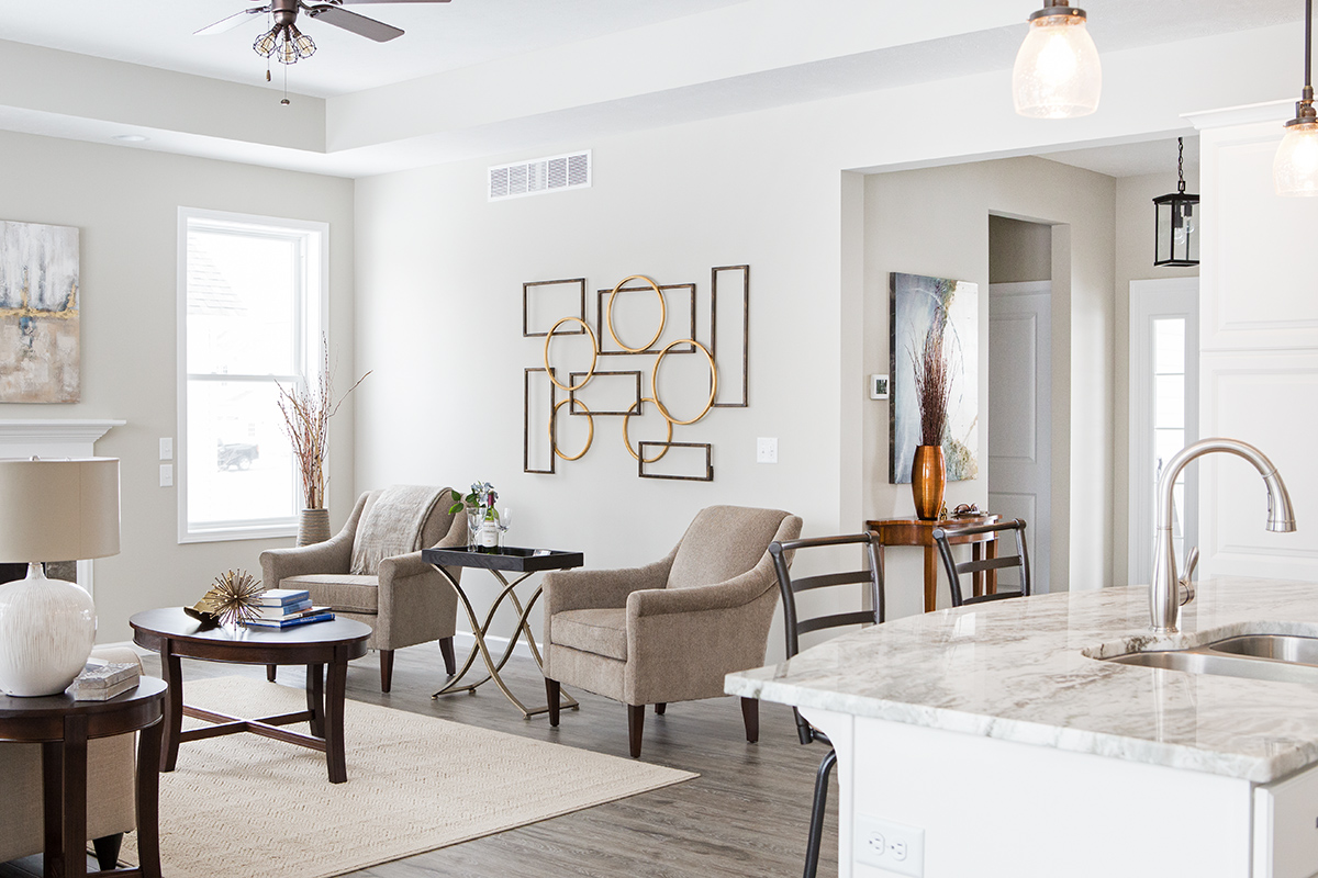
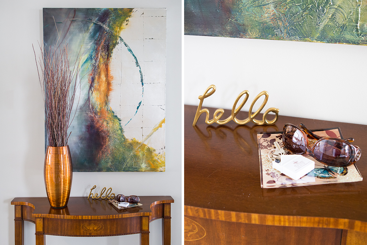
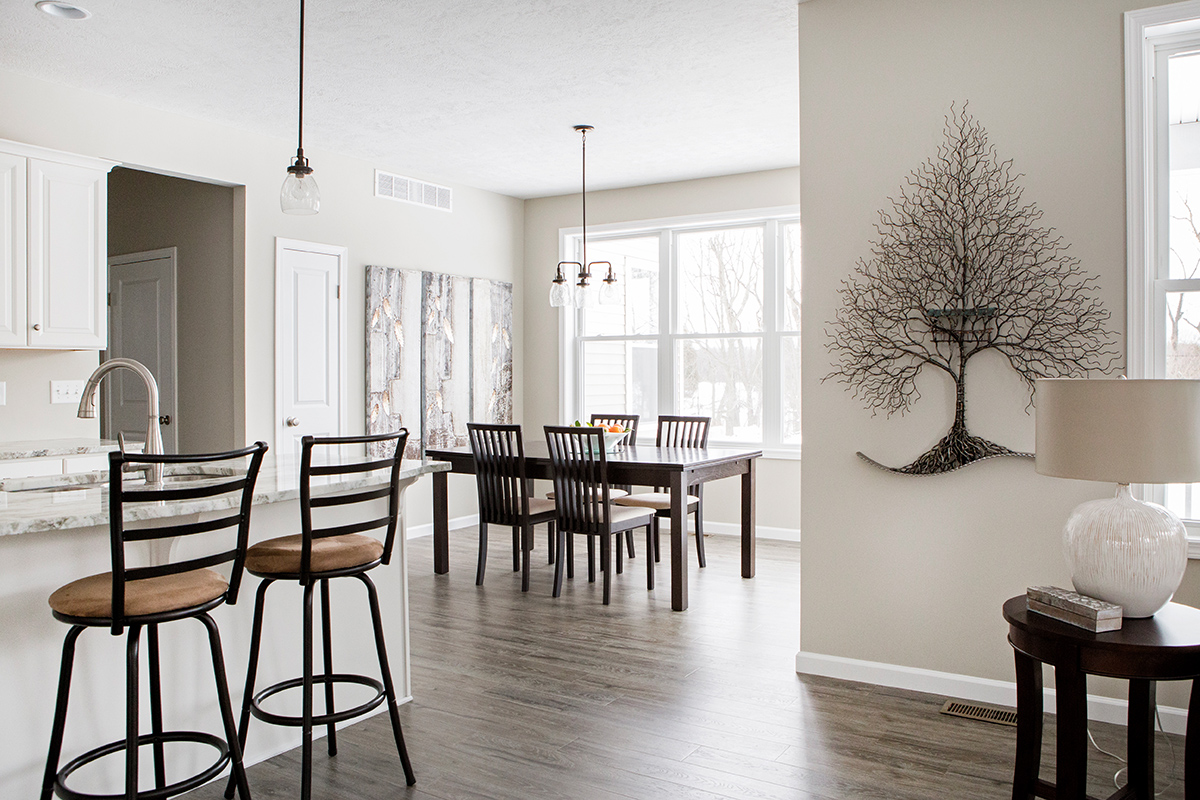
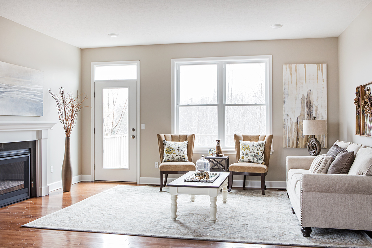
In open floor plan homes, it is important to create flow from one living space to the next. In this home the foyer, living room, kitchen and dining area can all be seen in one glance. To maintain that spacious feel I used open back stools and chairs, floated most of the furniture, and left plenty of space between pieces. The large pieces of artwork keep the rooms looking warm and add interest without taking up floor space. Creating a mood, a thought, or a feeling can be accomplished though the use of accessories and realistic props.
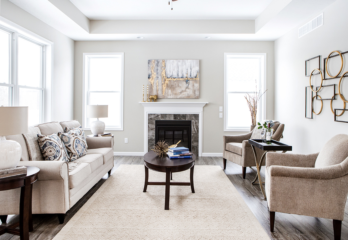
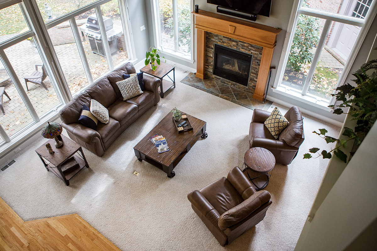
Furniture placement is crucial when staging a home. The size and position of the pieces is far more important than the pieces themselves. Generally speaking, most of the furniture I use is simple, neutral color, and generic in style. I never want the furniture to overshadow the features of the home. They should compliment it, not compete with it.
Simple furniture lines and airy pieces were used in this space. Contrast is king with dark furniture finishes against white cabinets and light walls. A variety of textures in the oversized art and a pop of color in the accessories complete the look.
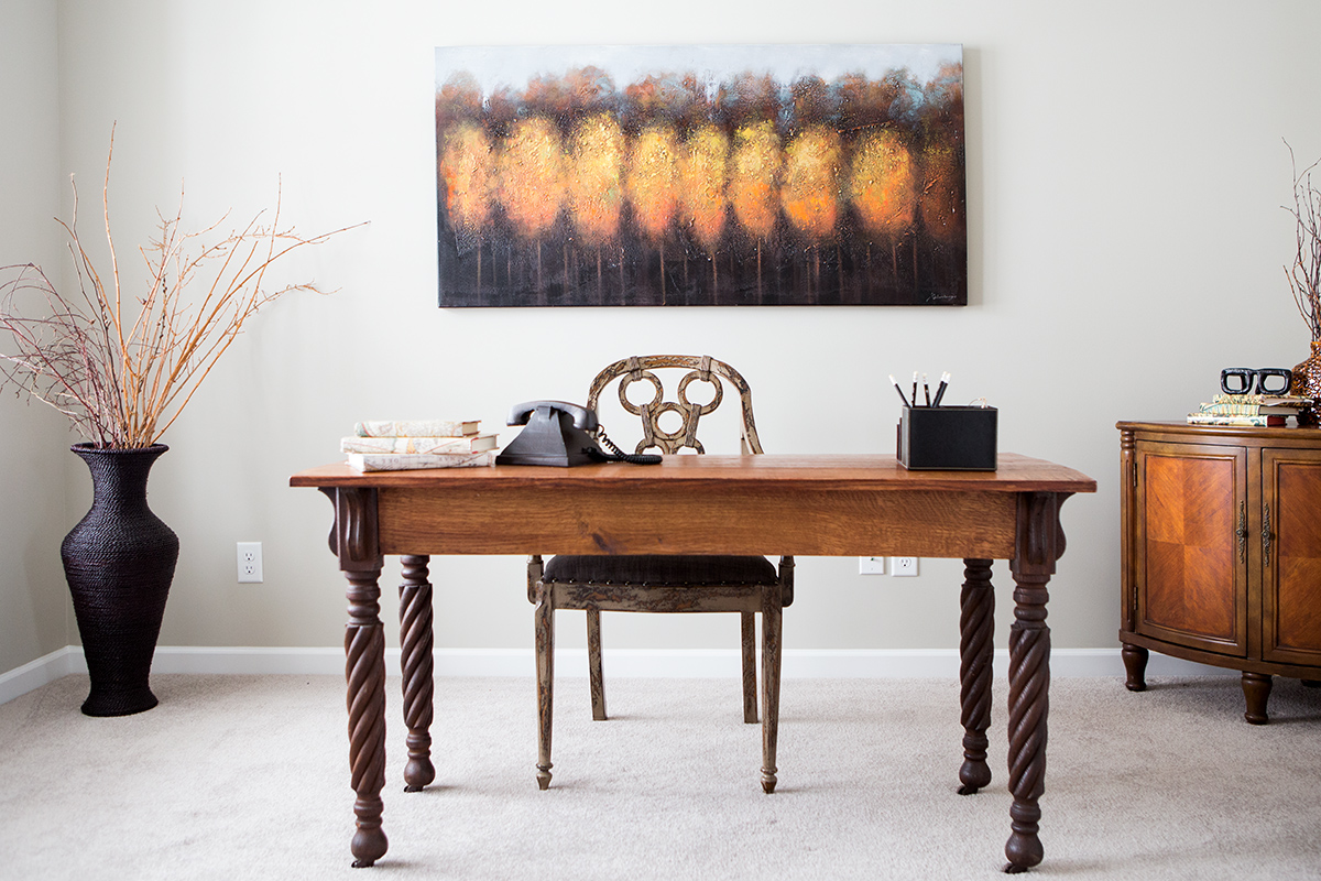
When a room does not have a lot of architectural detail or unique finishes, I step it up a bit with the décor.The furniture style and warm colors give this room its character.
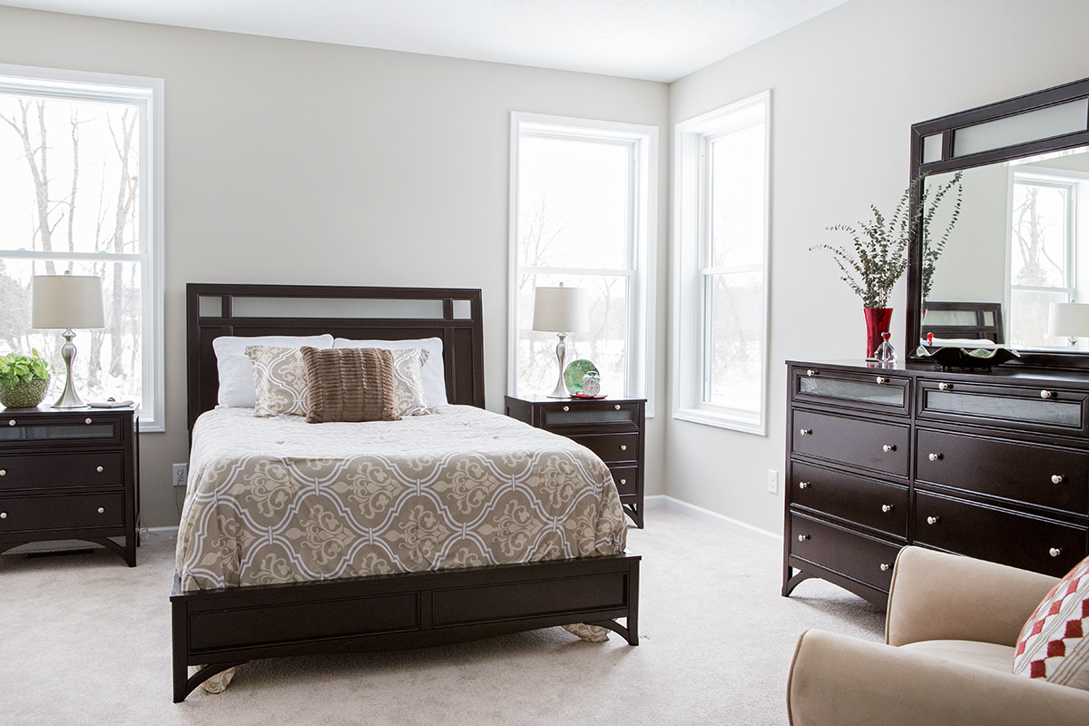
The master bedroom is accented in red and green. Note the easy chair off to the right. Whenever possible, I include a cozy seating area which further distinguishes this bedroom as a suite.
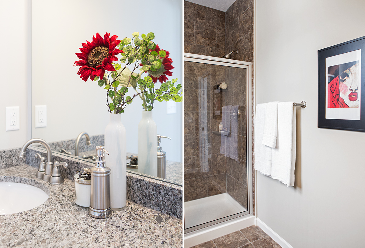
The red accents get carried through to the master bathroom to give it flow and continuity.
What are your thoughts on this vacant home staging? Did we get it right to make the home feel warm and inviting while giving a potential buyer a sense of how to live in the space? Leave a comment below, we’d love to hear your point of view!

