One of the many things that I love about my job as a home stager and interior designer is getting to see so many beautiful homes. Even as a child I enjoyed going for a ride looking for pretty homes. It was fun seeing a picturesque setting, interesting architecture, and beautiful gardens but using my imagination on what was inside was the most intriguing part. Even back then, I would imagine what I would change or add if it were mine to do so.
So many years later, this still brings me joy and excitement. I now like looking at homes at all price points, sizes and styles with the desire to make them a beautiful place for someone to call home.
During the past eight years as a home stager and designer, I have seen countless homes. Some have been more memorable than others. There are three that are unforgettable in detail. The most recent is featured in this blog. I had the good fortune to stage this beautiful lake front house in Webster, NY. Take a photo tour of this exceptional home.
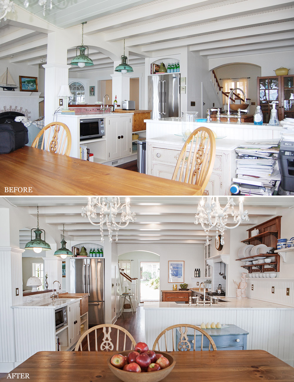
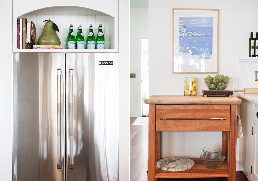
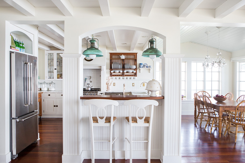
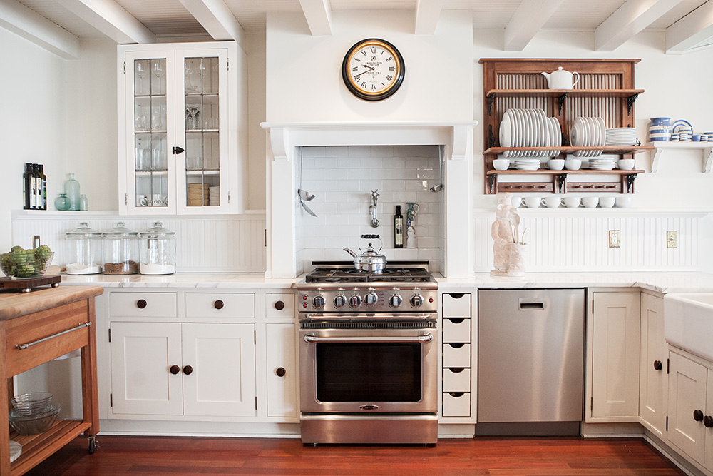
A butcher block table, which was being used as an island, was centered in the kitchen preparation area. It made the kitchen appear small and blocked sight of the Viking oven. We edited the china cabinet and put the butcher block table in its place and hung some artwork to add color to the mostly white space. In the eating area, we continued to add some blue by swapping the white cabinet for a blue one and cleared the space beside it. (photos above)
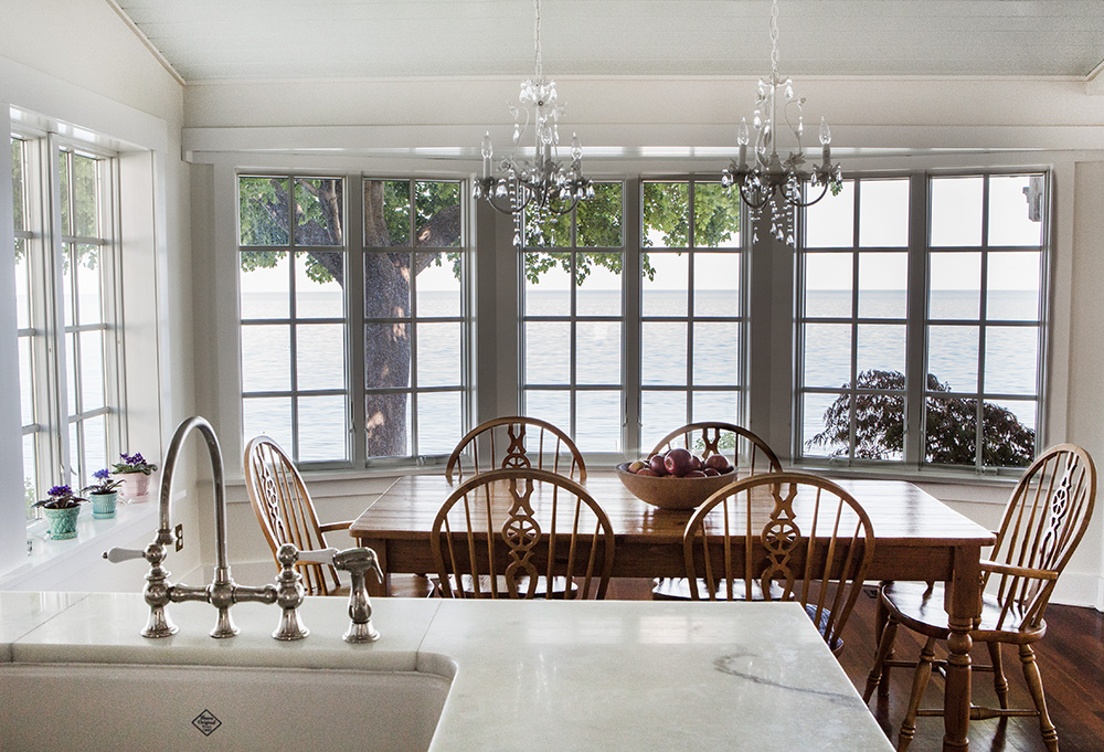
If the casual elegance of this kitchen alone is not enough to make you fall in love, look at that lake view!
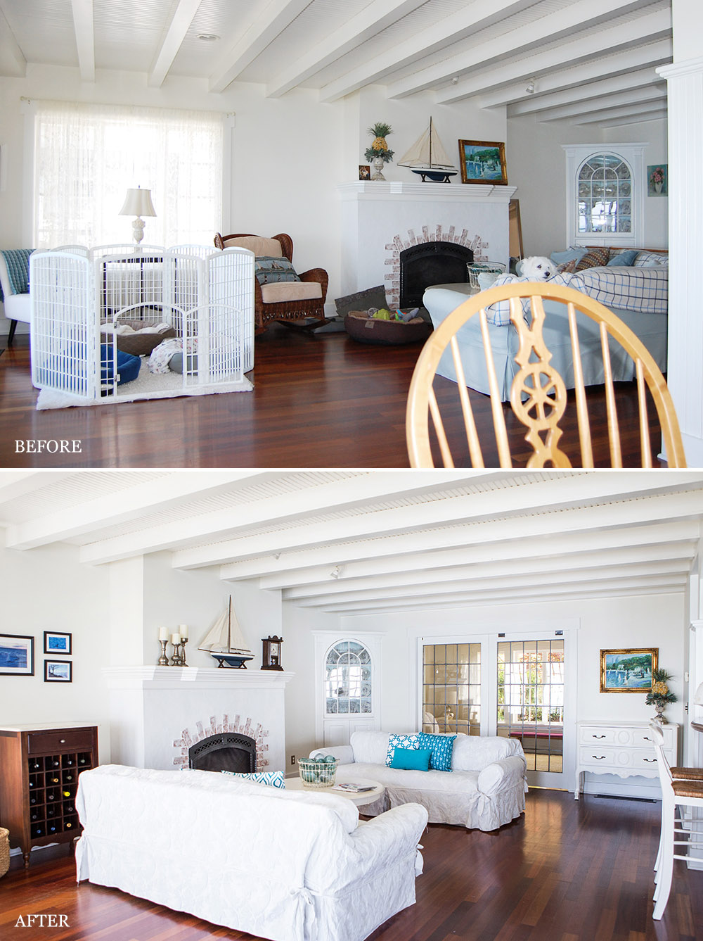
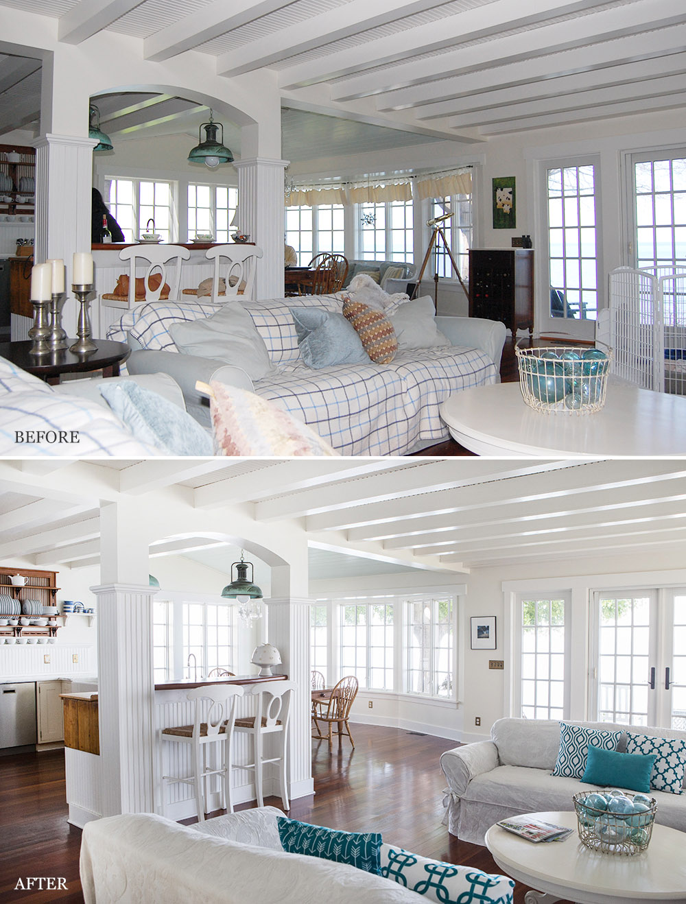
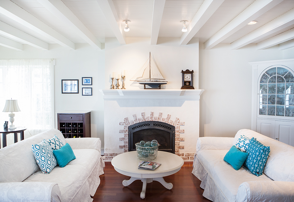
The placement of one of the sofas created a narrow path between the eating island and the living area. The sofas were slip covered for a shabby chic look and were repositioned to flank either side of the fireplace. The rocker was replaced with a wine cabinet that was between the wall of windows and glass doors. The telescope and white wicker sofa in the dining area were also removed. Removing the excess pieces opened up that amazing view!
The turquoise blue accents were repeated with the addition of trendy patterned throw pillows. The same artwork and accessories were used but were repositioned for better room balance. (photos above)
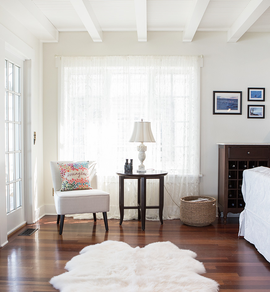
Clearing the pet beds and enclosure in this portion of the living area was crucial. The addition of a sheepskin rug (that was barely visible in a bedroom) a script pillow and placement of binoculars creates a mood and appeals to the emotions. “Imagine” the views you will see through the binoculars! (photo above)
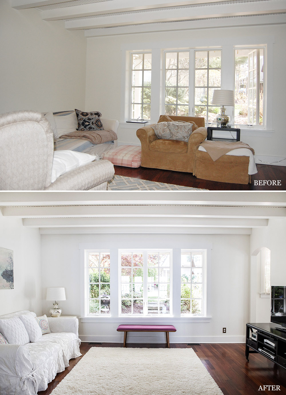
The wing back chair was removed to open the flow of traffic from one room to another and to allow easy opening of the pocket french doors. Since the view of the gardens is magnificent, we replaced the bulky chair and ottoman with a simple bench. This clearly puts the focus on the window and the view.
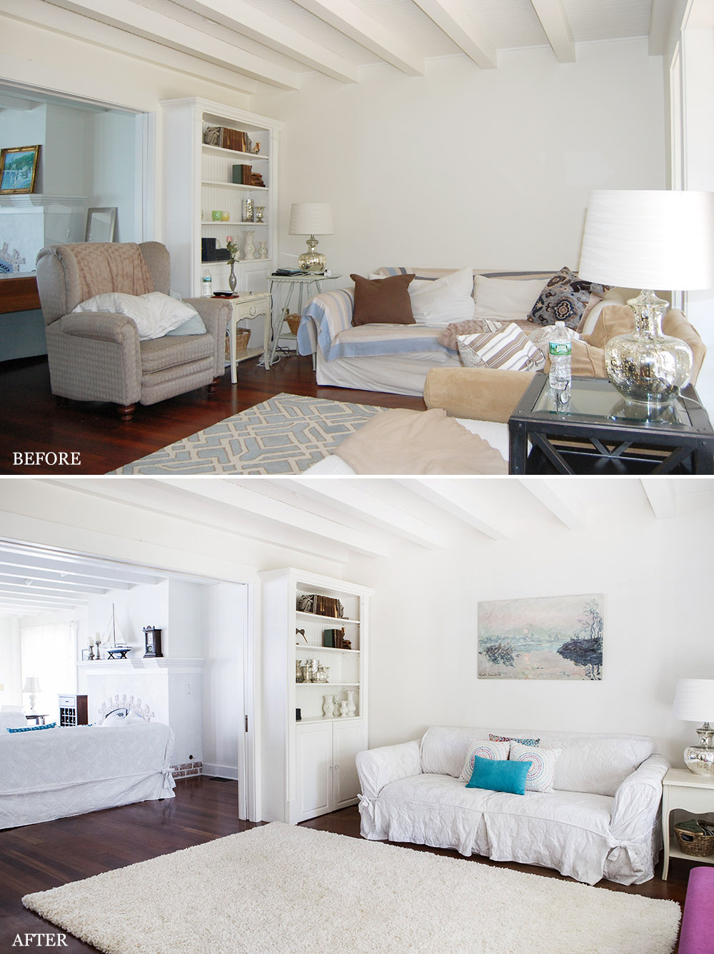
We repositioned the side tables to fully expose the built in cabinets, added some artwork over the sofa and added a touch of turquoise blue. (photos above)
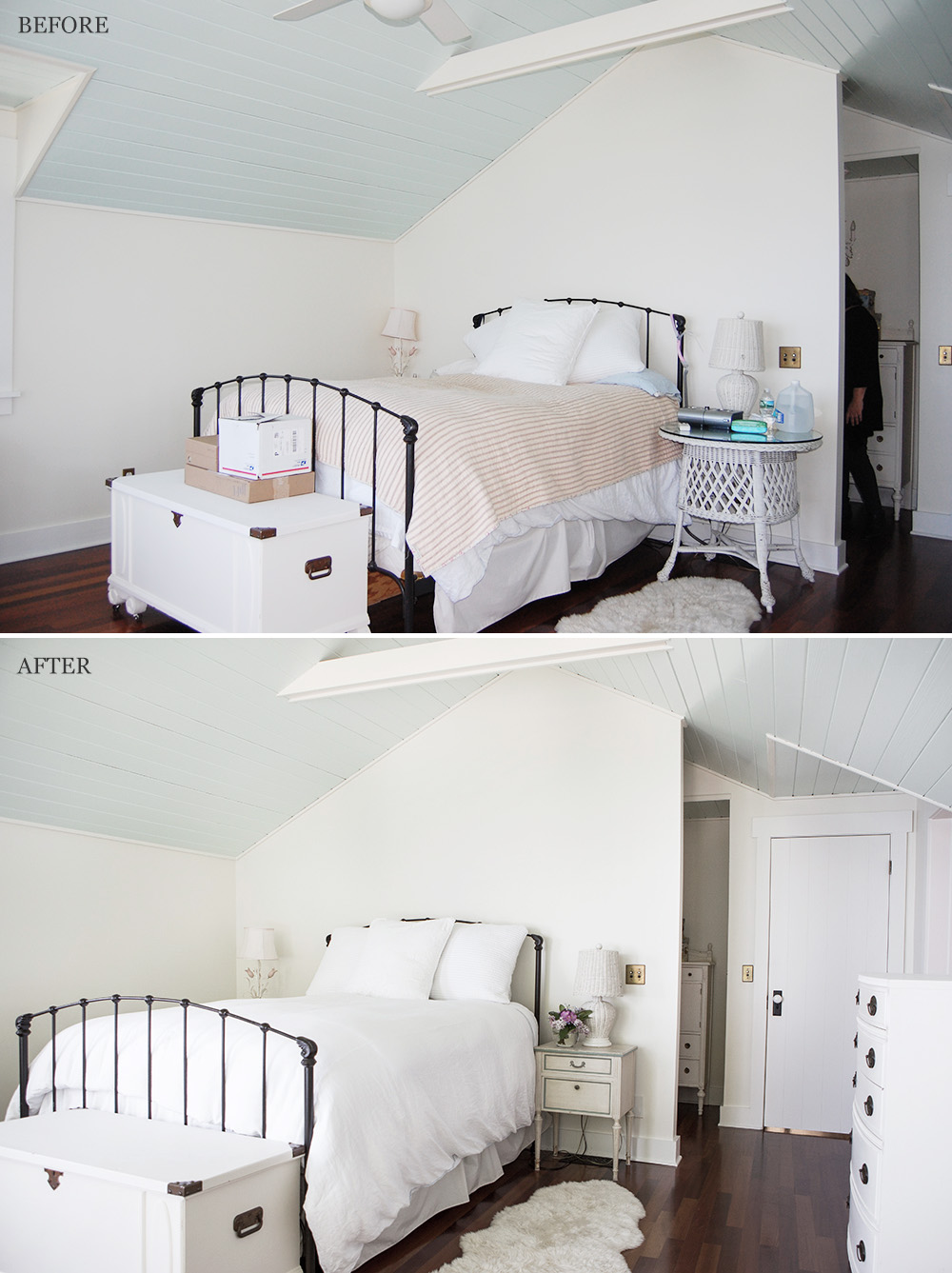
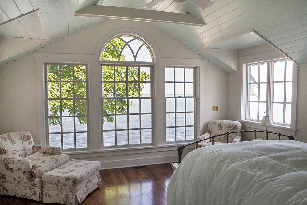
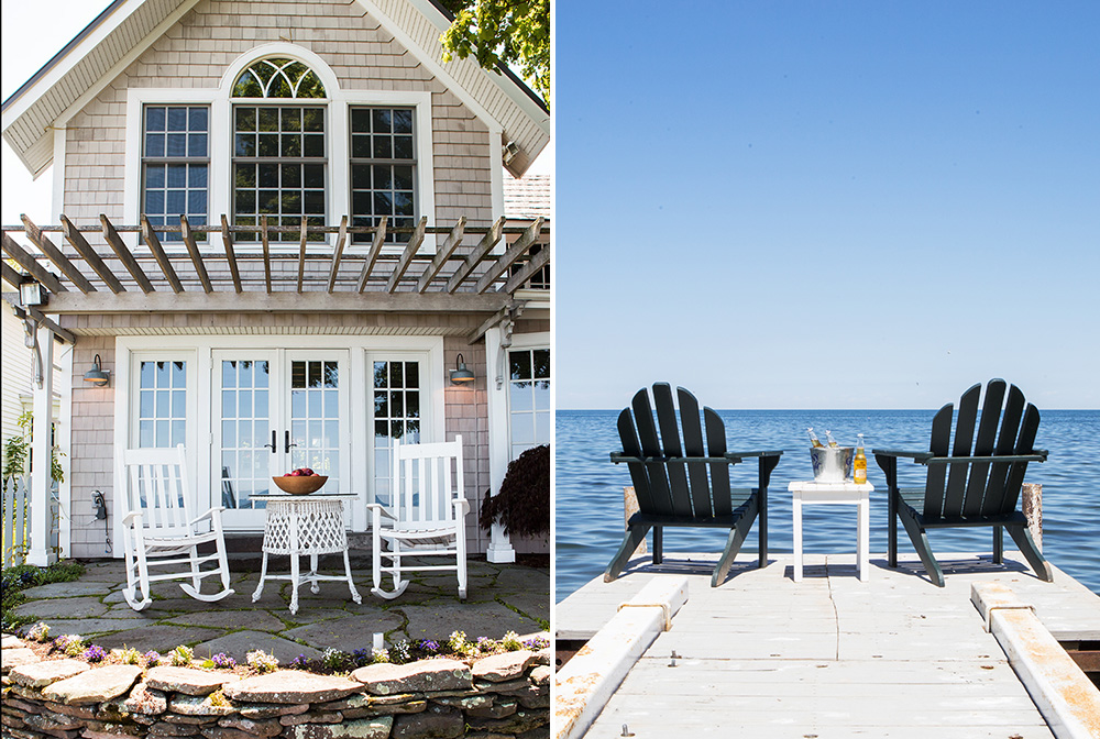
Not much was changed in the charming and simple bedroom. The white wicker table was repurposed between two rockers on the terrace and smaller table was used as a nightstand. (photos above)
Imagine waking up to this view! (photo above)
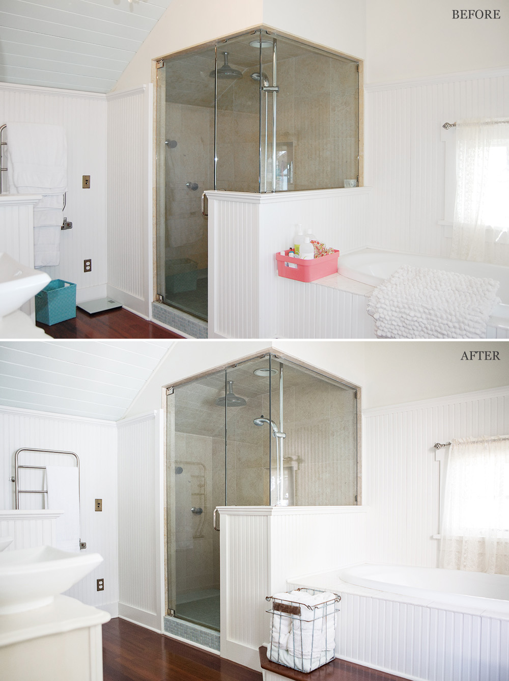
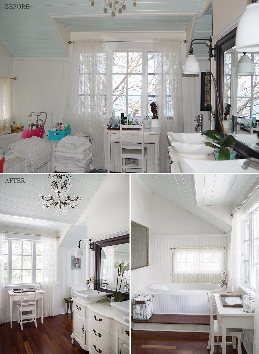
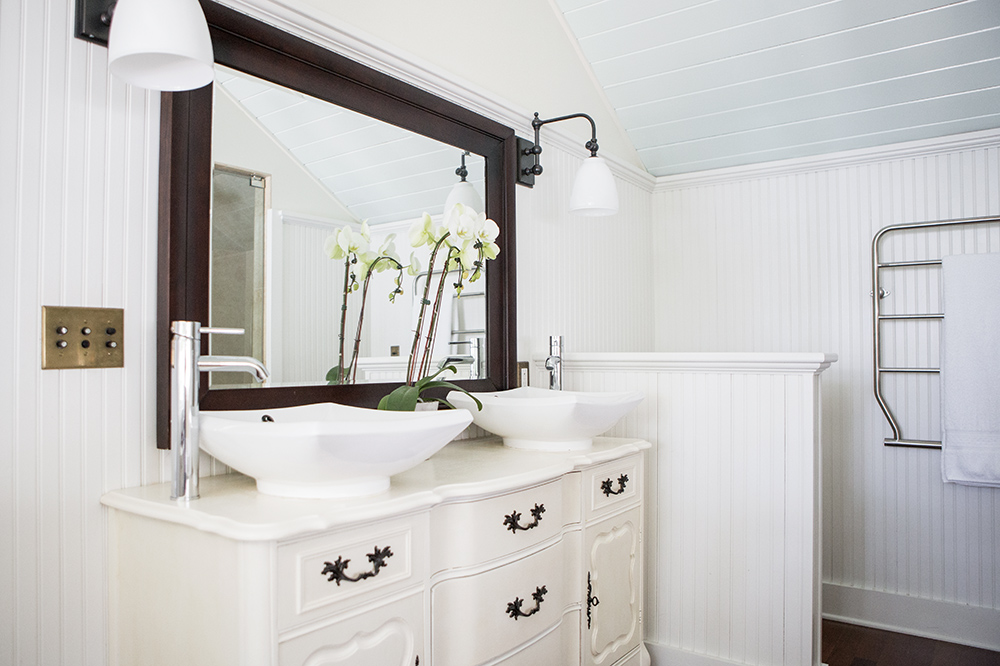
Just some organization and editing helped to uncover the true character of this bathroom. (photos above)
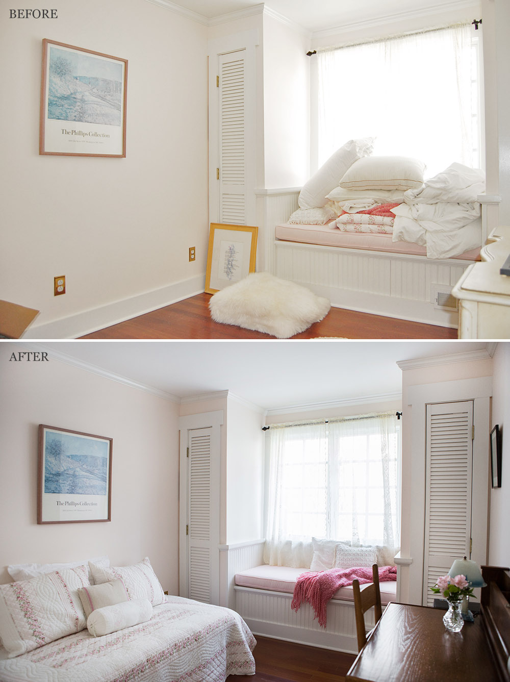
The homeowner was not currently using this small bedroom. The use of a daybed shows that there is plenty of space to be a guest bedroom, to use as a quiet place to work at a desk, or a comfortable place to curl up with a blanket and a good book. (photos above)
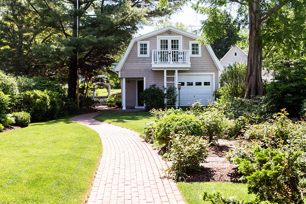
This is the backside of the garage with a separate entrance to a beautiful loft apartment complete with a deck and lake view! (photo above)
Sit back, relax and have a cold one! This is what lifestyle staging is all about. (photos above)


Nice work!
Just beautiful. I see your touches everywhere in this home.