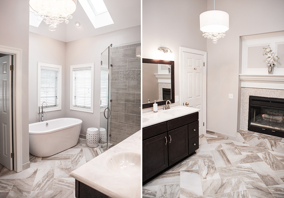
When remodeling my master bathroom I had three main goals in mind: enlarging the shower, replacing the corner whirlpool tub with a free standing one and creating a tranquil atmosphere. As anyone who has had a home built or done major remodeling will attest to, there are so many details that are a part of the process. Each detail contributes to the overall look and feel of a room.
Choose Similar Shapes and Finishes for Hardware
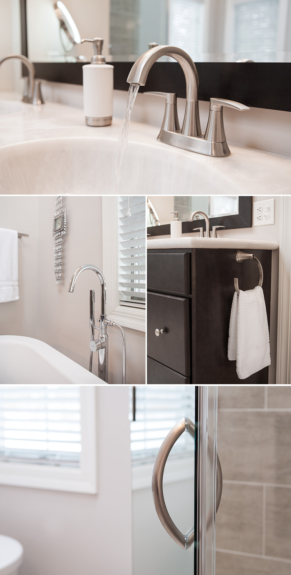
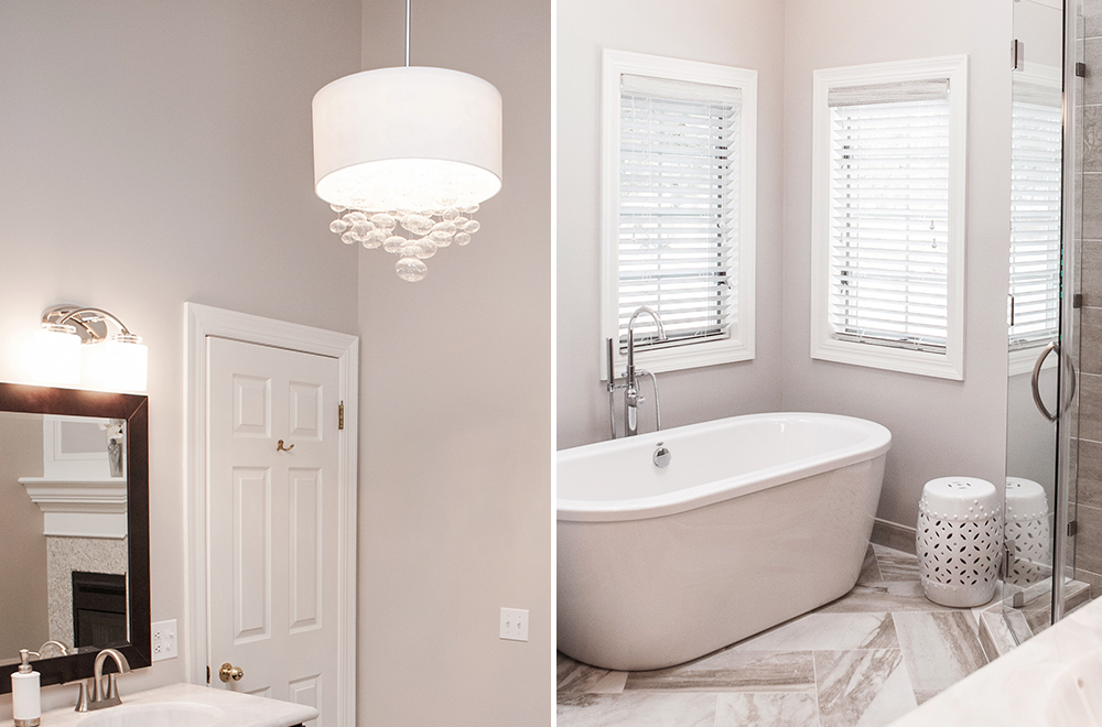
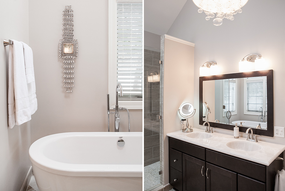
I chose brushed nickel for the plumbing fixtures, the lighting finish for the vanity and chandelier, and the knobs and handles on the vanity and shower door. While it occurs to most people that choosing the same finish is important in creating a cohesive look, choosing similar shapes is less intuitive. Take note of the arched hardware on the sinks, tub, vanity lights, shower door handle, and towel holder. It is a subtle detail but a significant one. The smooth curves also add to the gentle, soothing look.
Coordinate Tile Choices and Select Pattern Layout
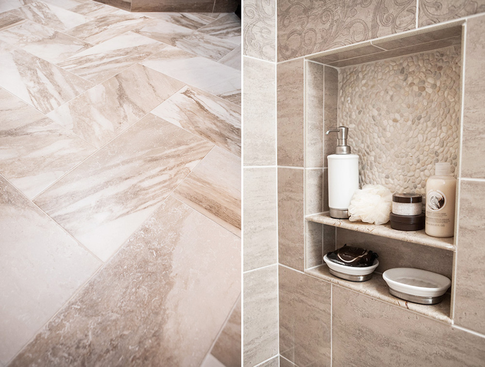
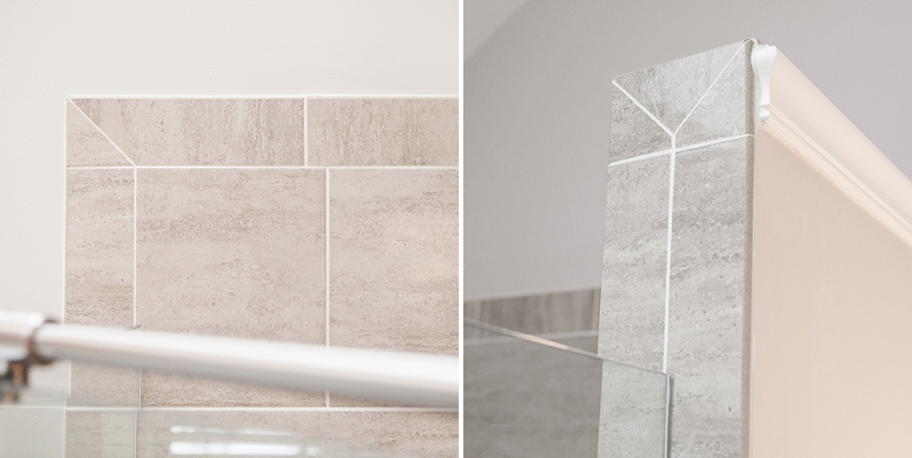
In most cases I recommend using four different styles. Using more is likely to look busy and using less will likely be boring. In this case, I choose 12” x 24” floor tile. Since all the other elements in the room were fairly plain and simple, I was able to use a herringbone pattern that made a statement. A word of caution, it takes a very skilled tile installer and the use of a bit more tile for this pattern. Both the floor and the detailed corners of the shower walls (pictured below) show the experience of the installer.
For the shower walls I chose a 12” x 12” tile with muted neutrals that had a coordinating patterned tile from the same manufacturer. I used this in a small quantity to create a decorative border in the shower. Choosing a trim tile from two different product lines can be tricky since they are used side by side, causing any color variation to be very noticeable.
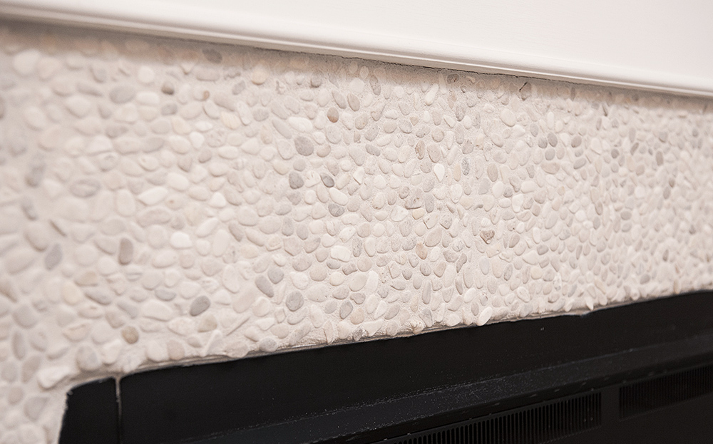
Aside from color and pattern, the shower floor tile should be a material that is slip resistant. I selected pebbles for both their natural look and the way they feel beneath bare feet. However, many clients say they find the feel of pebbles and river rock irritating. So try before you buy. I repeated the pebble tile in the back of the shower shelves and around the fireplace for a cohesive look.
Select Lighting Based on Appearance and Function
The room already had recessed lights over the tub areas, which were kept in place. Since they are adjacent to the skylights on dimmers they are used mostly for effect lighting in the evening. Although I opted for one large mirror over the vanity, I used two separate smaller lights over the sinks. The placement and wattage of those fixtures was based on function. They are the main source of lighting and need to be bright enough for putting on makeup and shaving. The chandelier is a decorative piece with glass bubbles hanging from its center that add to the softness of the room. While it can provide an abundance of additional overhead light, it is used on the dim setting mostly for ambiance.
Decorate with Purpose
With the exception of the simple vase of white orchids on the fireplace mantel, the accents were selected to fulfill a purpose. The crystal wristwatch is functional and the garden stool can be used as a seat or temporary place for discarding clothes. It is also the perfect height to place a glass of wine while soaking in the tub!
Source Guide
General Contractor: McKinnon Construction | Paint Color: Sherwin Williams – SW6071 Popular Gray | Tile: Artwalk Tile | Bathtub: Fergusons | Framless glass shower doors: American Building Systems | Lighting: Lowes | Vanity and cultured marble counter top: Kitchen Express II | Hunter Douglas wood window blinds: Parkway Window Works | Wristwatch: Tripar International, Inc. | Ceramic garden stool: Bed Bath & Beyond
Interior Design: Leona Piro | Photography: Kristin Leitten




I’m in love with your bathroom. It’s the perfect balance of textures and elegant neutrals. Beautiful photos too!
The bathroom is gorgeous! I love the clean, crisp lines and the photos show it off in such a professional manner! Thanks for sharing.
Your tip to coordinating fixtures and handles was very helpful. Like you mentioned, if all the fixtures and handles have similar finishes and shapes, even on something more recent like the new shower enclosure it helps to make the room feel more cohesive. when planning a remodel, it may help to choose materials and hardware before it begins so you know if there is anything you plan to reuse.