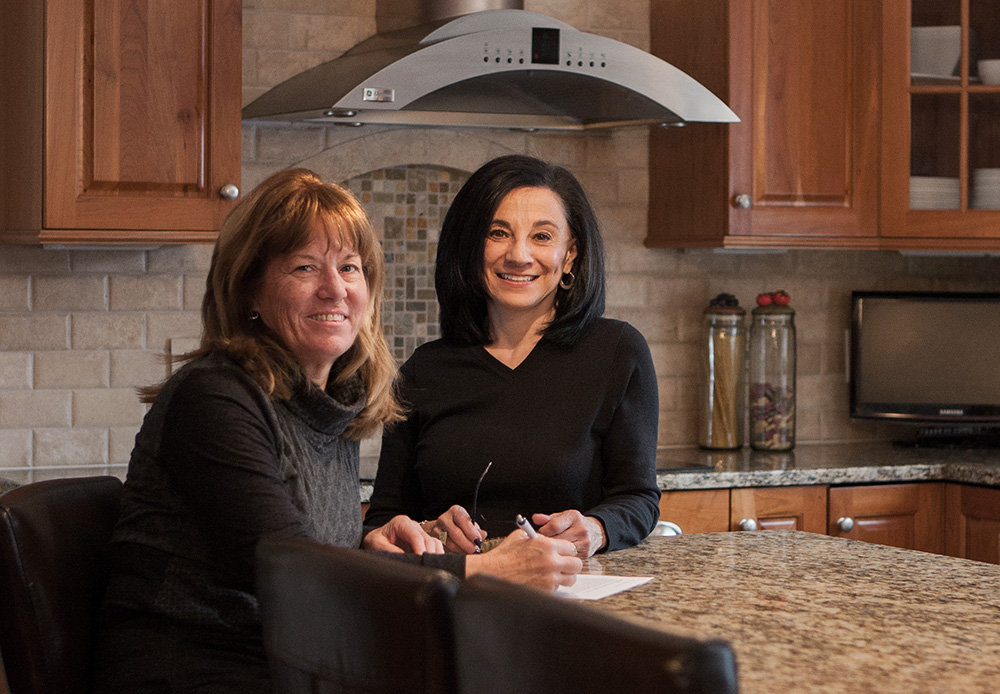
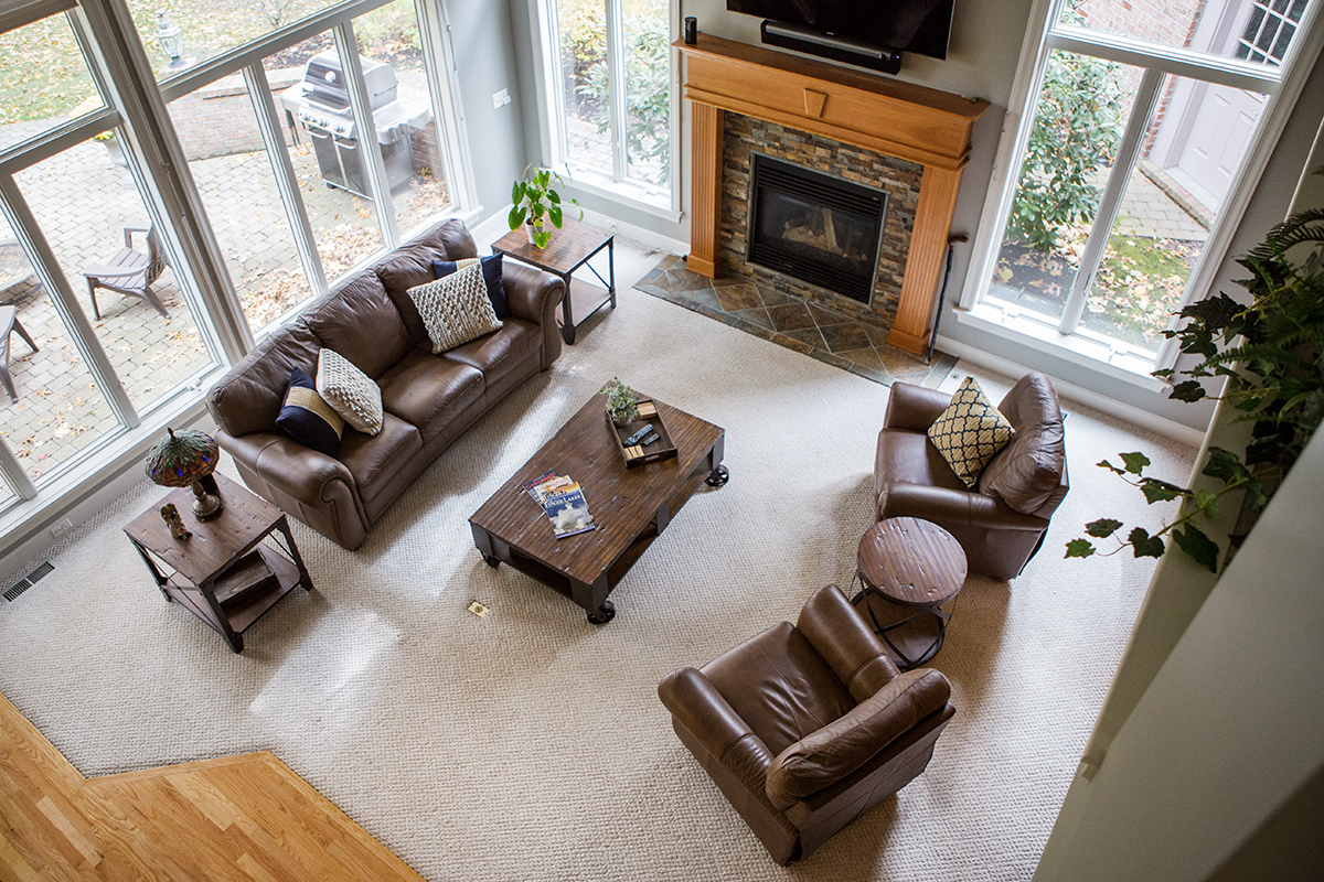
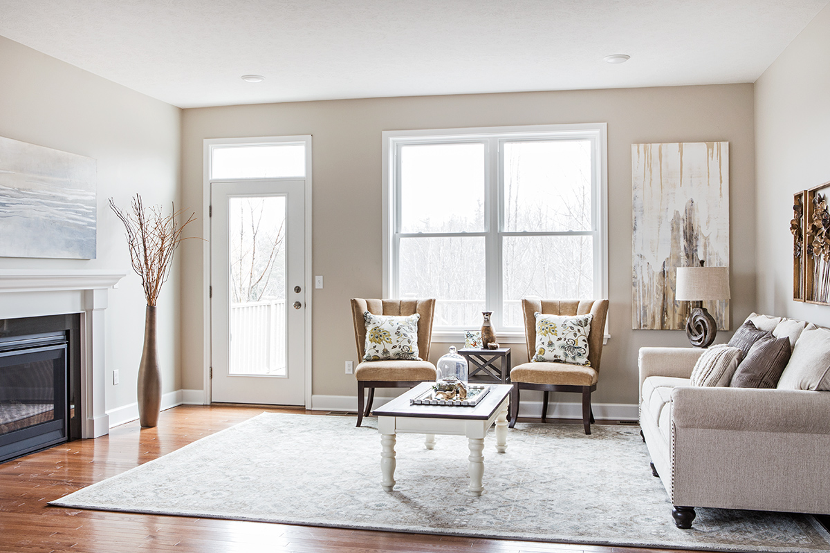
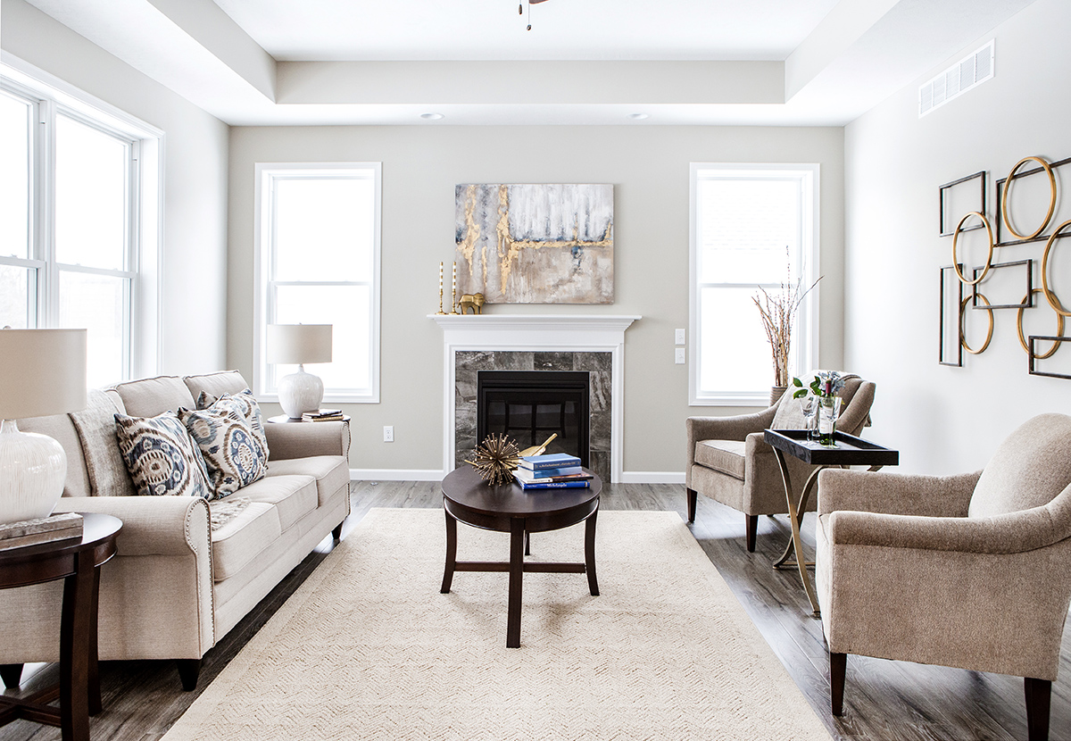
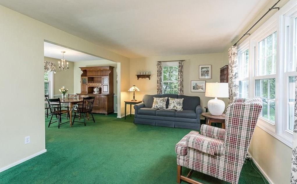
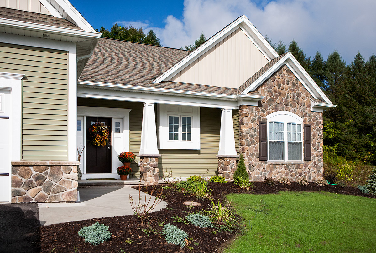
I worked hand in hand with my client Mary preparing her beautiful nearly 4,000 square foot Fairport home to go on the market. Since she had already made some major upgrades, had neutral paint colors, and kept the home in excellent repair, my job was to help her bring it to the next level.
When Mary told me that she planned to do a For Sale by Owner, I was skeptical. She explained to me that she had done this successfully with two other homes. I cautioned her about the pitfalls but she remained confident in her ability.
During the initial three hour consultation we edited and rearranged furniture, switched up artwork, and accessorized. I left Mary with a long to-do list and referrals for services like carpet and window cleaning. Five weeks later Mary was ready for my next visit. I made some minor adjustments, did some light staging in the finished basement and worked with Kristin assisting on the photo shoot. Together, Mary and I finalized the wording for her online advertising.
With a quick turn around on the photos, Mary was able to place the listing and open house ads the following day and held an Open House just two days later. Twelve couples attended the open house resulting in multiple offers over asking price! Just take a look at these photos and you can see why.
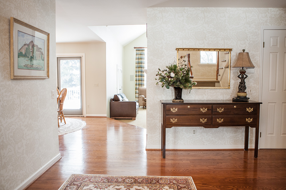
Foyer – We started with some simple changes in the foyer by editing the antique photograph on the wall and removing the outdoorsy floor décor. (photos below)
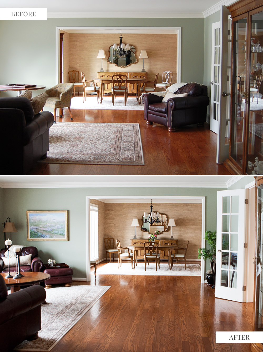
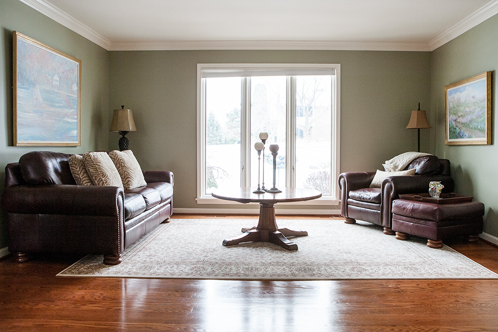
Living/Dining Room – The living room needed editing, furniture and carpet rearrangement and the addition of artwork. The large-scale leather chair that was obstructing the traffic flow and partially blocking the view of the dining room was moved to the other side of the room across from the sofa. The game table and chairs were moved to the lower level in an area that we staged as a game room. We took the ottoman from another room and with a tray on top, used it as a side table. The addition of the artwork and the floor lamp were the finishing touches on the highly visible wall.
The area rug, which was breaking up the room in an awkward way, was repositioned to define the sitting area of the room. A coffee table from the basement was just the right piece. The large curio cabinet was replaced by a smaller version that had been in the dining room. A narrow console table and potted plant replaced the leather chair. (photos below)
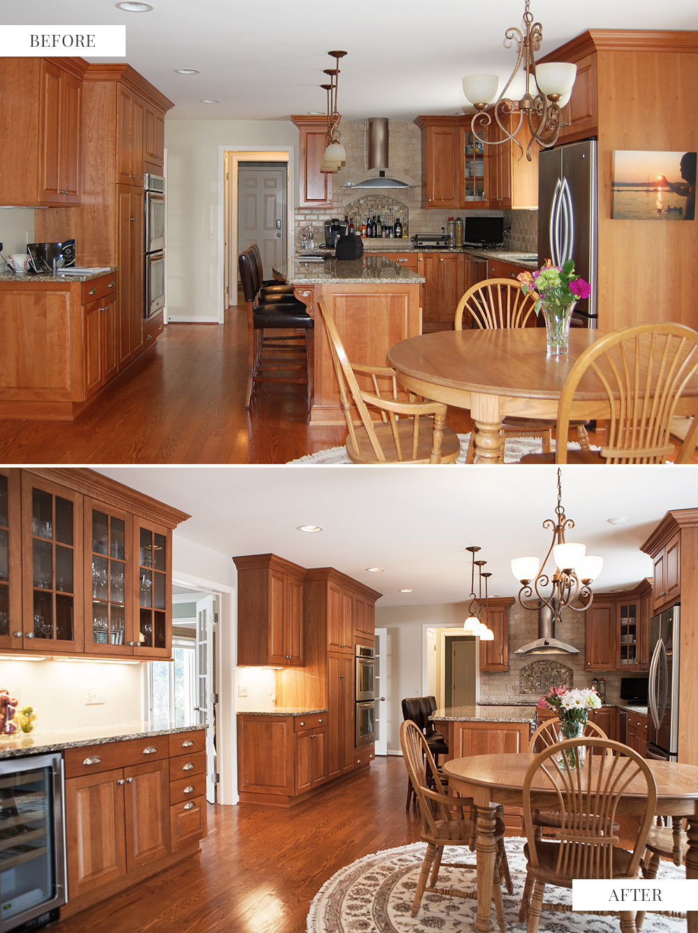
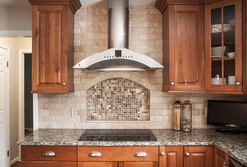
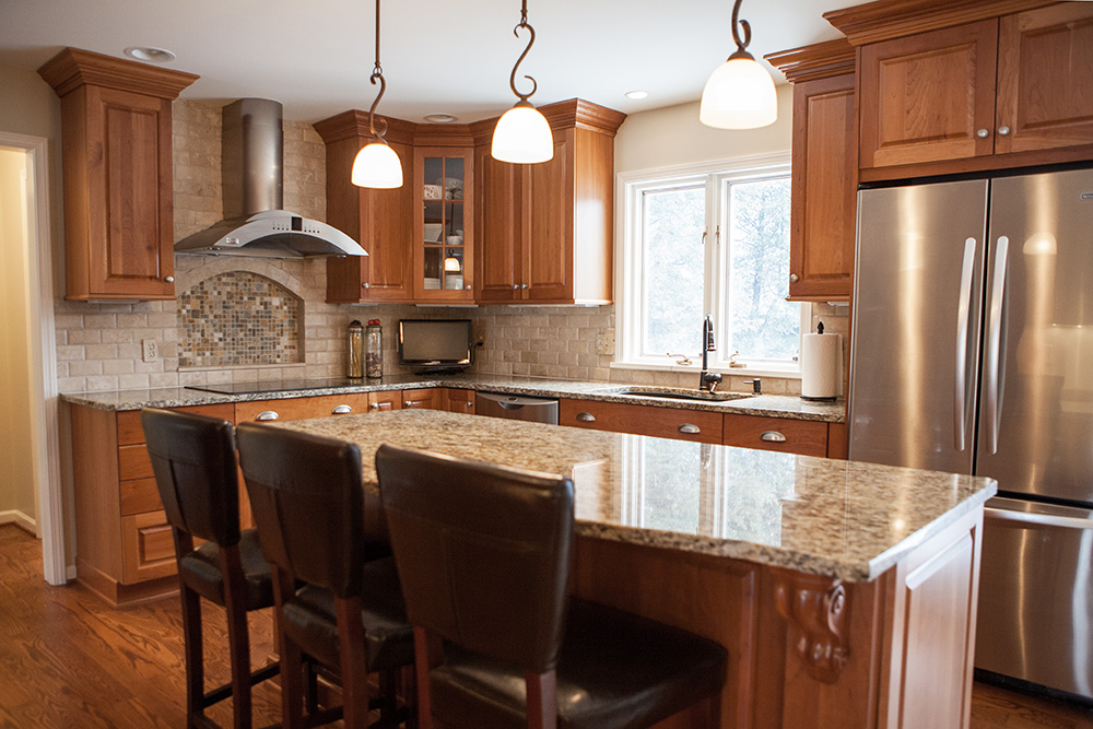
Kitchen – Clearing the kitchen countertops accentuated the amount of surface space and put the stone inset shelf in plain sight. (photos below)
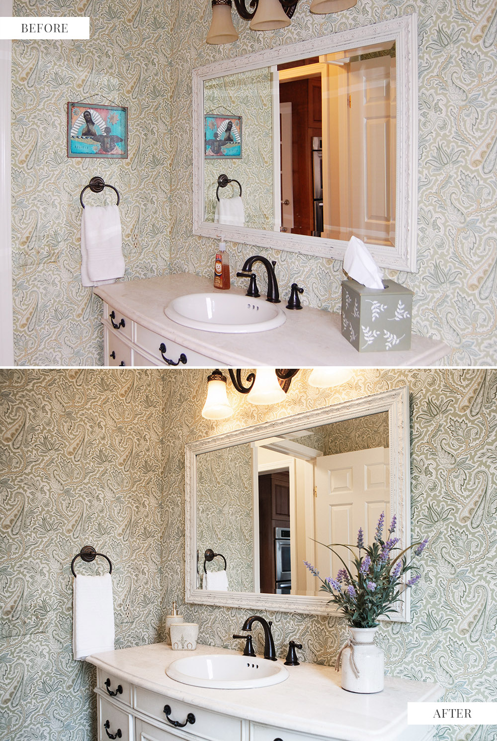
Powder Room – Removing the distracting artwork makes the wallpaper look soft and appealing rather than busy. Replacing the grocery store variety hand soap and the tissues with some decorative items created a more upscale look. (photos below)
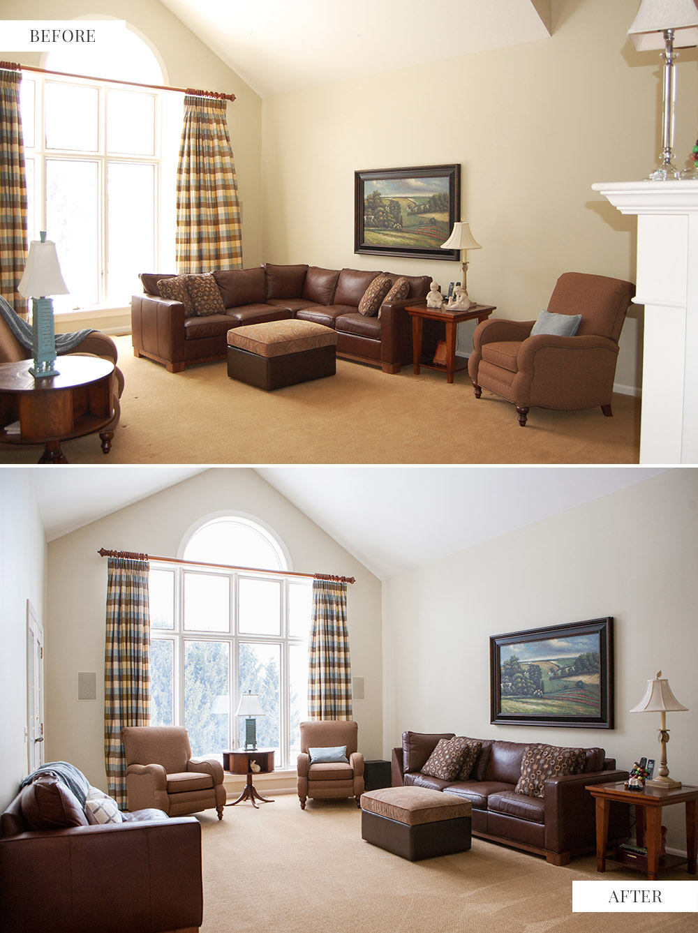
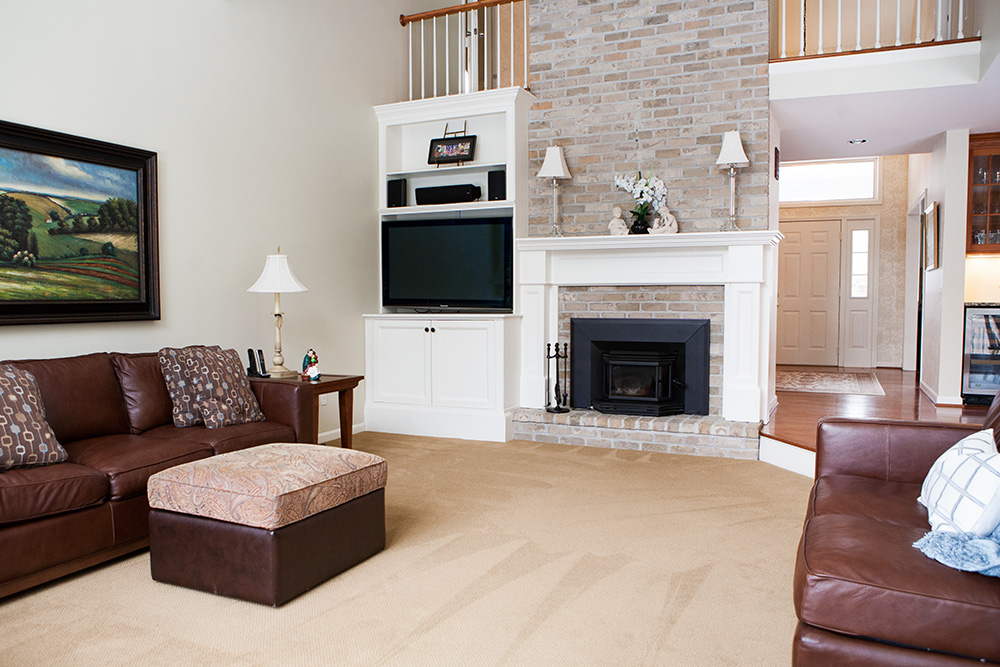
Family Room – Staging defines and draws attention to the focal point of a room. The placement of the heavy sectional sofa made the room look off balance and detracted from the window. Centering the chairs and table on the window brought attention to the focal point of the room and the beautiful view. (photos below)
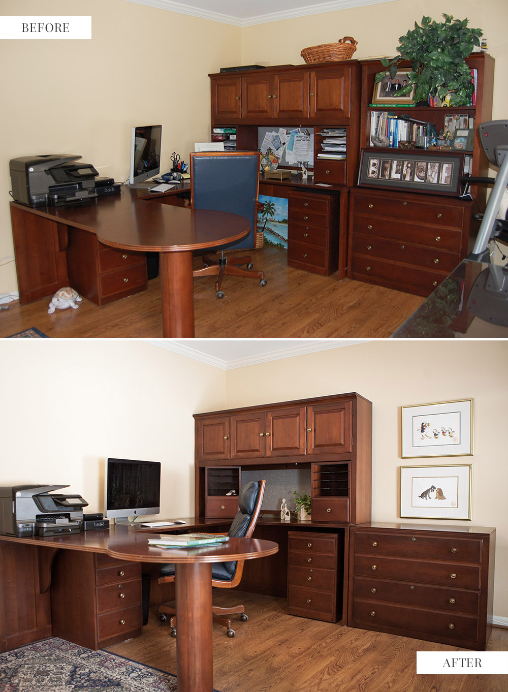
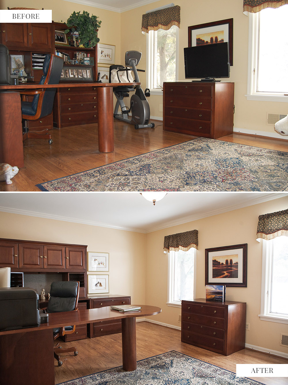
Office – Just removing the personal items and clearing the clutter and eliminating the exercise equipment would have made a big difference in this room but we took it a step further. The two tall side-by-side cabinets took up a lot of visual space and made that side of the room look heaving. We separated them and repositioned the artwork. Removing the television that was blocking the artwork and repositioning the area rug finished the job. (photos below)
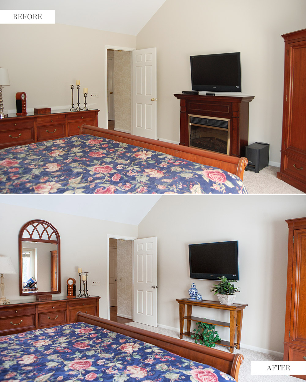
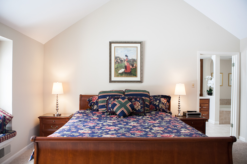
Master Bedroom – We replaced the faux fireplace, which may have been misleading to buyers and replaced it with a narrow console table to create an even wider traffic path. The addition of a mirror over the dresser was more than aesthetic. The mirror reflects the light from the window directly across from it and also echoes the beautiful window seat. (photos below)
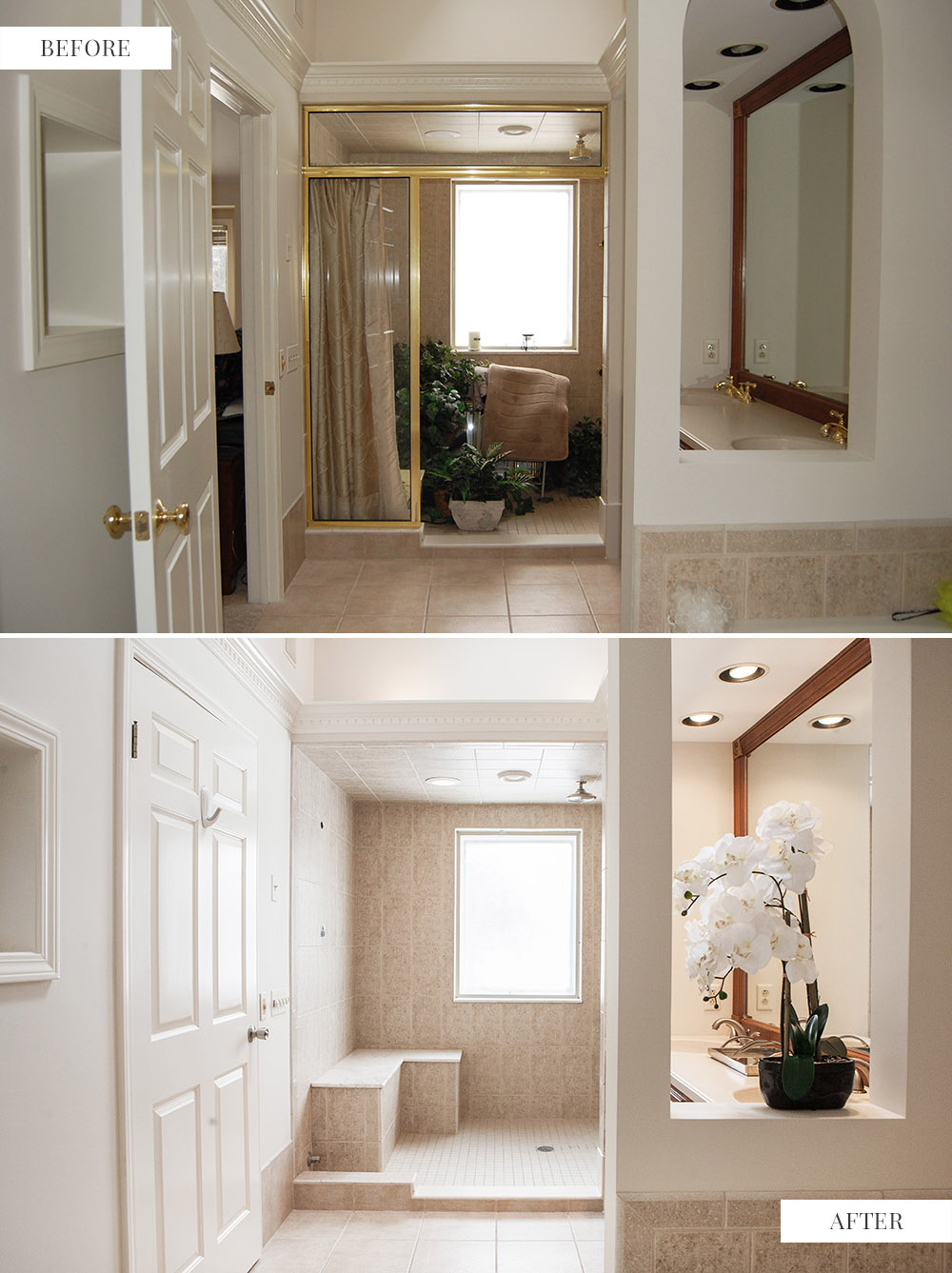
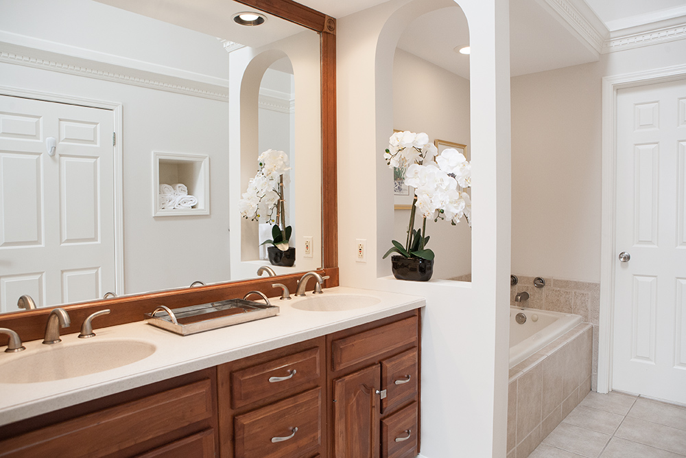
Master Bath – The huge walk-in shower is fully exposed and some decorative touches add to the elegance. Note the reflection of the wall inset shown in the mirror. This was originally for an old style television but we repurposed it to store towels. (photos below)
Staging: Leona Piro // Photography (afters): Kristin Leitten

